
Technology
React Native, Azure, ElephantSQL, Figma, Inkscape, Krita
Role
UI/UX Design, Development, Branding, Deployment
Team Member: Aishwarya Joshi, Branden Husted, Edom Maru, Harry Gu, Steven McKelvey,
Calvin Finds is a lost and found app for Calvin University students, written in React Native. My role in this development team was UI/UX designer, front-end developer, and various debugging.
Project Overview
Calvin currently lacks an efficient and organized system for managing lost and found items on campus. Calvin's current system involves lost-and-found boxes around campus and a written record of lost items. The absence of an easily accessible, on demand system not only leads to frustration but also results in the unnecessary prolonged loss of personal items, which could otherwise be easily recovered with a better solution in place. Our app, Calvin Finds, aims to offer easy item reporting, streamlined item searches, real-time updates, identifiable pictures, specified locations and community engagement.
In contrast to existing apps that cover a broader region, our app is designed exclusively for Calvin students and faculty, offering a simplified experience for lost and found on campus. It features an authentication system and requires minimal personal information, ensuring easy setup, quick posting, and secure communication. This sets us apart from existing options and empowers the Calvin community for seamless lost and found retrievals.
My role in the team is to design the UI, UX, and Brand Guidelines for the app, front-end development, integration with the back-end, and debugging.
Research and Planning
Target Audience
The target audience are primarily College students at Calvin University, as well as some staff.
Key Findings:A large proportion of undergrad students and graduate students, as well as some campus staffs that has a wide range of age and demographics. Therefore we chose colorful color palette that vibes with Gen-Z style, and the UI and functionality is heavily influenced by modern social media app.
Primarily on campus, the students and staff are usually busy.
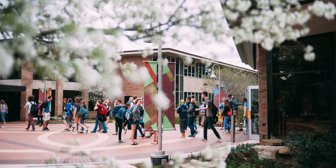
Credit: Calvin University
Most are experienced with phones, especially social media apps.
UI/UX Design Brainstorming
• Familiarity
inspired by modern social media apps, but posting lost/found items instead.
• Consistency
Long rectangular shapes indicates input fields, rounded shapes indicates clickable buttons.
• Accessibility
We designed the application with inclusive mind. We want to take cared of the users who may
have motion or certain vision disabilities, Se we use bright yellow as primary button colors. large text
as primary font, and huge buttons for easy user interaction.
Management Method
• Sprint Planning
We organized our work into sprints - time-boxed periods (for us, typically 2-3 weeks) during which our team worked to complete a set amount of work and reached a milestone, such as completing UI/UX design, or complete deploying the server. This allowed us to:
- Focus on specific, achievable goals within a fixed timeframe
- Regularly reassess and adjust our priorities
- Deliver working increments of our product at the end of each sprint
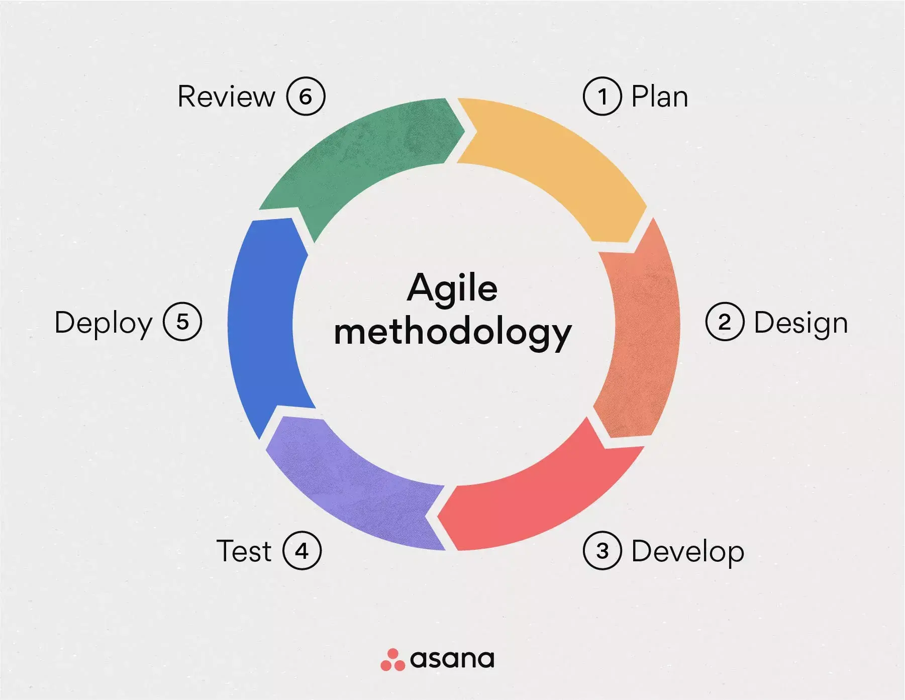
Credit: Asana
• Sprint Meetings
We held weekly sprint meetings after class to review progress, plan upcoming tasks, and address any challenges.
• Design-Development Integration
As both a designer and developer, I was able to seamlessly integrate Figma designs with React Native development, ensuring a smooth transition from design to implementation.
• Kanban - Trello Board
We used a Kanban board in Trello to visualize our workflow and manage tasks efficiently. Our board included:
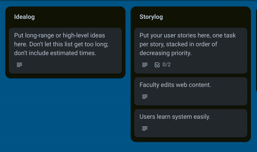
- Idea log - to record and track project ideas
- Story log - to document user stories
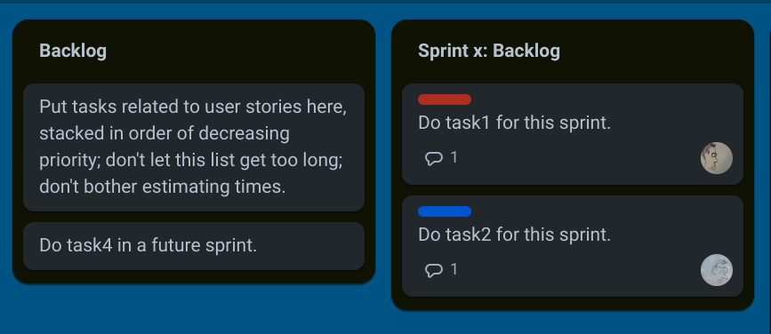
- Backlog - for prioritized, sprint-ready tasks
- Sprint Backlog - tasks committed for the current sprint
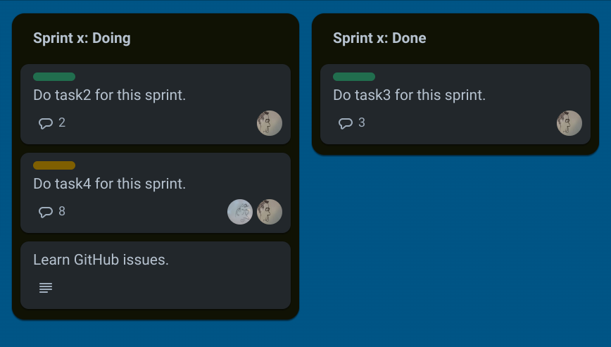
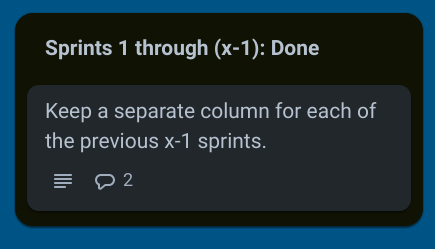
- Doing and Done columns - to track task progress within the sprint
Kanban Template we were using:
Technology Stack Evaluation
• ElephantSQL
Used as our database, as required by the professor. It provided a reliable PostgreSQL database solution with cloud hosting capabilities.
• Microsoft Azure
Utilized for server hosting, as required by the professor. Azure offered robust cloud computing services that integrated well with our other technologies.
• Figma
Our choice for UI/UX design. Figma provided an easy-to-use, free platform for collaborative design work, which integrated seamlessly with our development process.
• draw.io
Selected for creating various diagrams such as UI models and deployment diagrams. Its user-friendly interface made it easy for all team members to contribute to visual documentation.
• React Native with Expo
Used for client-side development, as required by the professor. We specifically chose to use Expo for a managed workflow, which offered several advantages:
- Simplified package management, making it easier to handle dependencies
- Quick setup and initialization of the project
- Access to pre-built UI components and APIs
- Easier testing and previewing on physical devices
- Streamlined build process for both iOS and Android platforms
This managed workflow approach with Expo allowed us to focus more on developing features rather than configuring the development environment, which was crucial for our project timeline.
• Github
Used for hosting the source code and documents, as required by the professor.
Design
Social Media Inspiration
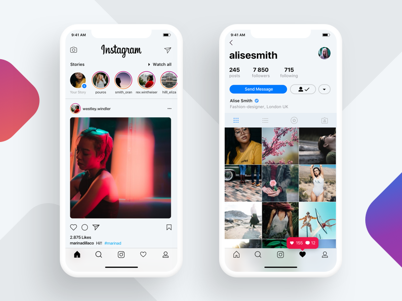
Our main screen design draws primary inspiration from Instagram:
- Image-focused layout to showcase lost/found items clearly
- Card-based organization containing pictures and essential information
- Comment sections for users to provide additional details
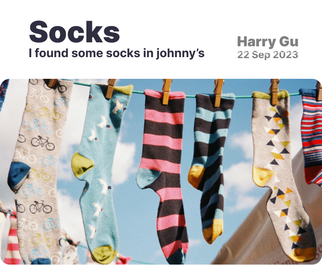
- Fixed layout for text elements (title, subtitle, date, finder's name)
Credit: Ivan Martynenko
We examined other platforms but found Instagram's approach most suitable:
- Facebook and Twitter are primarily word-focused, less suitable for our image-centric needs
- Adapted Instagram's image-first approach to fit our specific lost and found context
Color Scheme and Branding
We chose bright colors like yellow and red to resonate with our target audience:
- Inspired by popular platforms like Snapchat
- Reflects current Gen-Z fashion and style preferences
- Creates a vibrant and energetic user interface

Accessibility Considerations
Our text styling choices support both accessibility and modern design trends:
- Implemented bold text throughout the app to improve readability
- Bold text aligns with recent design trends, creating a modern look while enhancing visibility
We prioritized accessibility in our color selections:
- Avoided problematic color combinations (solid red/green, blue/yellow) to accommodate color blindness
- Used orange as a key color to enhance visibility for users with color vision deficiencies
By combining social media design influences with careful consideration for accessibility, we've created an interface that is both familiar to our users and inclusive for those with different visual needs.


Usability Testing
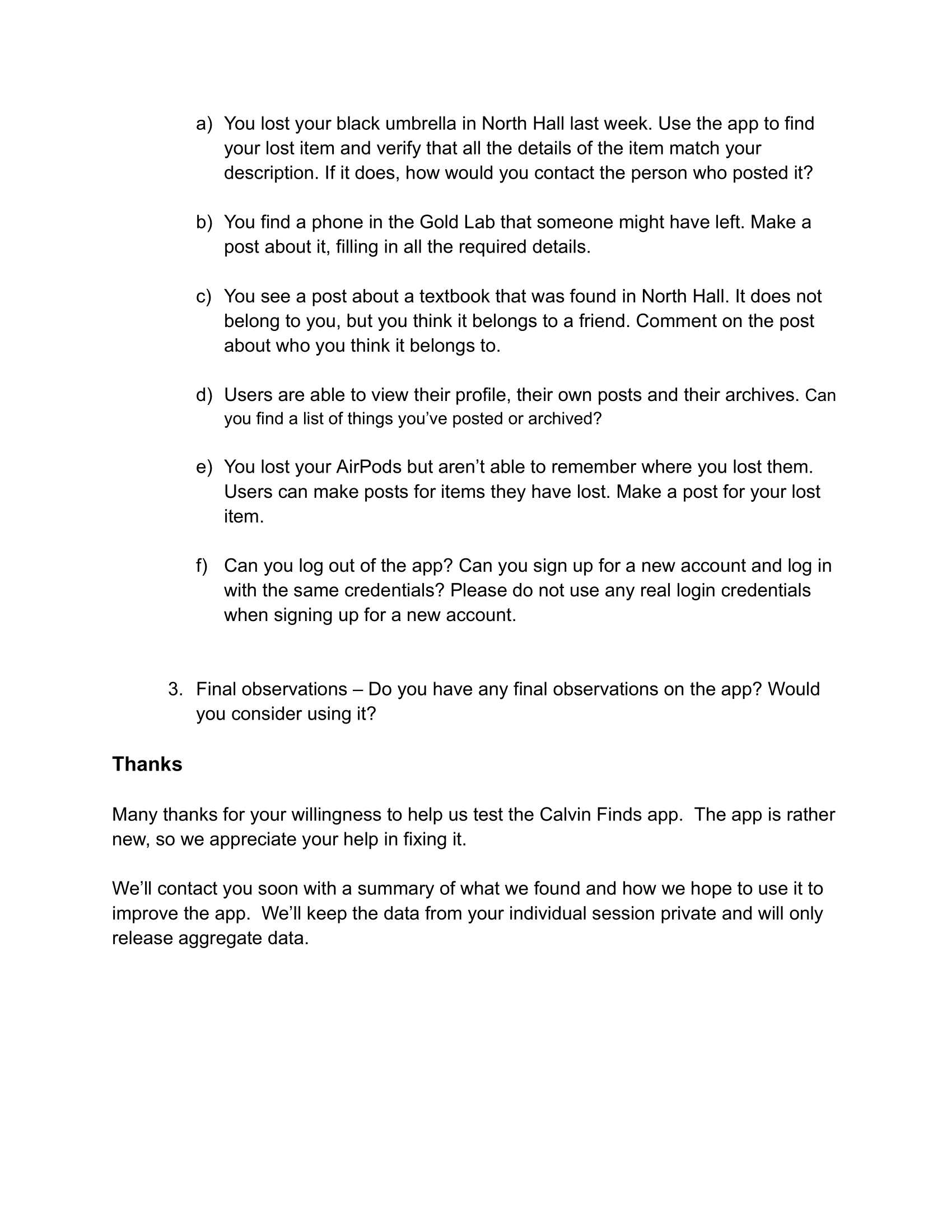
We conducted comprehensive usability testing to gather valuable user feedback and improve the CalvinFinds application. Our approach was methodical and user-centered, designed to uncover real-world usage patterns and potential areas for improvement.
- 8 computer science students from lower classmen who are willing to volunteer
- Conducted in a room in the Science building at Calvin University Campus for easy access to students
- Two rounds of testing were performed
- Two-person testing team: one to read the script, one to record responses
- Participants were encouraged to think aloud during tasks
- No specialized software used; focus on direct observation and manual recording
- Structured script to ensure consistency across all test sessions
- Introduction and background questions
- Initial reactions to the main page
- Series of specific tasks to complete within the app
- Final observations and feedback
- Finding a specific lost item and contacting the poster
- Creating a post for a found item
- Commenting on an existing post
- Viewing personal profile and posted/archived items
- Creating a post for a lost item
- Logging out, creating a new account, and logging in
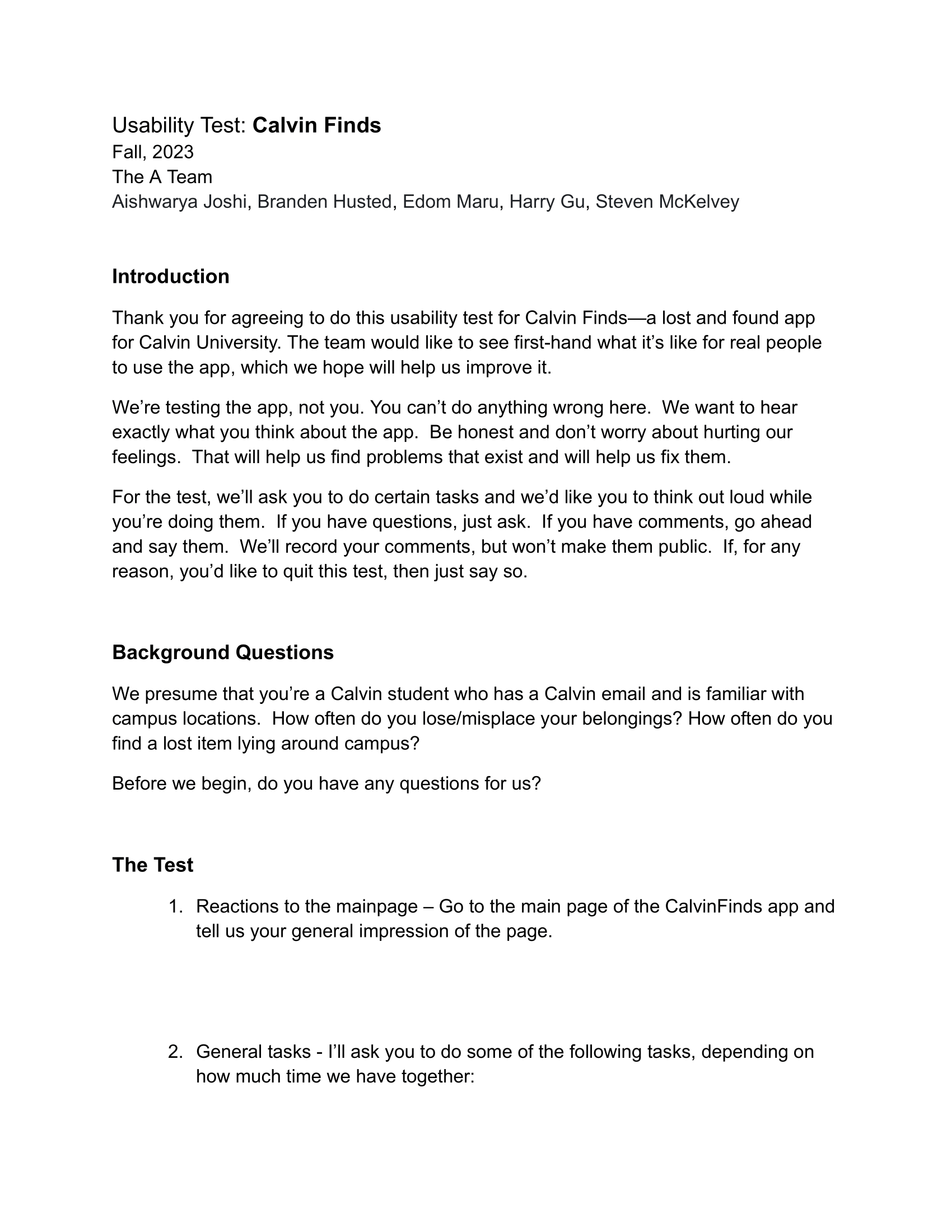
Usability testing Script - Page 1
Usability testing Script - Page 2
Key Findings and Improvements
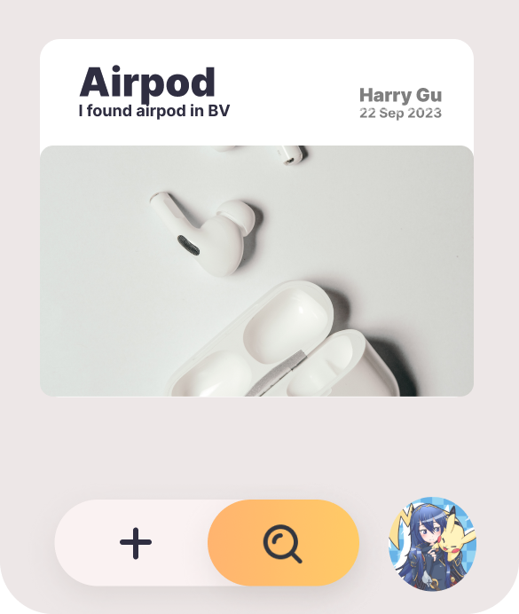
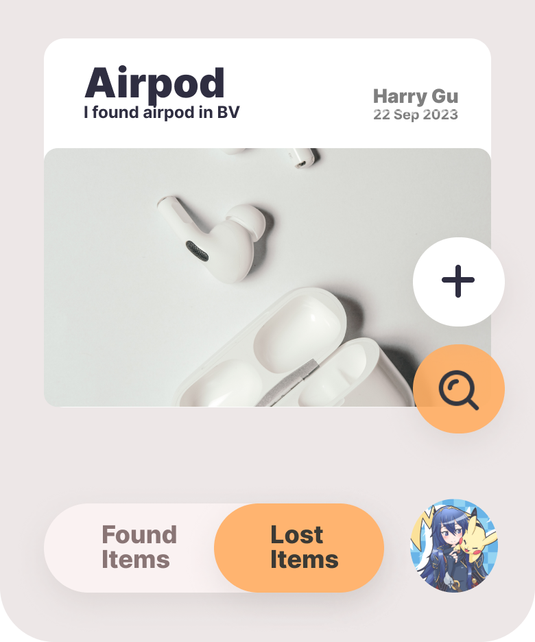
Users found the button for toggling between lost and found items on the main page confusing.
Action: Change the UI layout and adding a help page to explain its functionality.
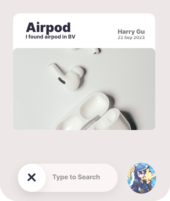
Users struggled to find items when searching by description rather than item name.
Action: Updating search queries to include item descriptions.
before
after
before (search activated)
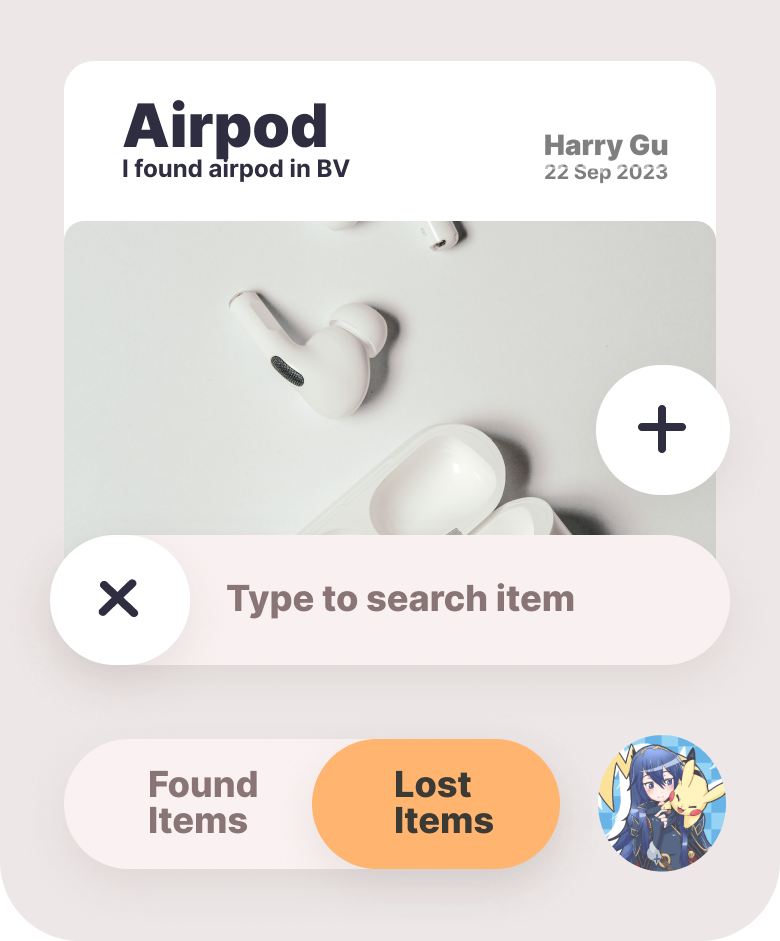
after (search activated)
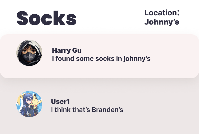
before
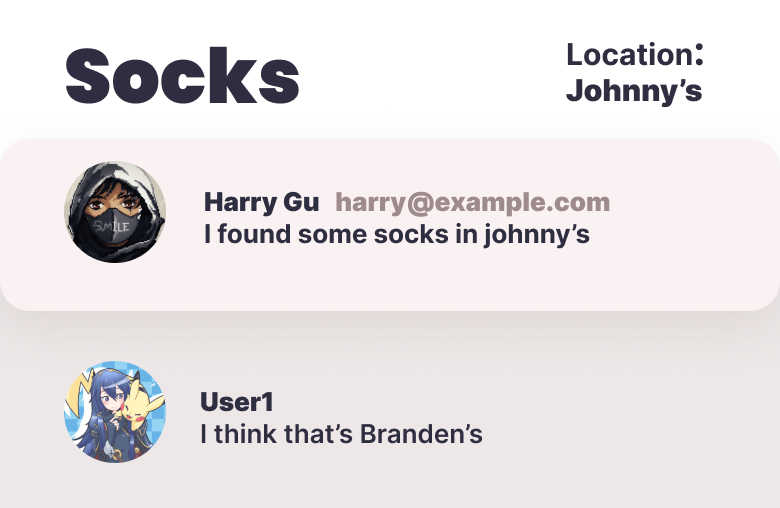
after
Users were uncertain about how to contact item owners.
Action: Updated the details page to show both username and email of the poster.
Users wanted to take pictures directly in the app when posting items.
Action: Implemented the ability to use the phone camera for taking pictures within the app.
Bug with the numbers displayed on user profiles for posted and archived items.
Action: Working on accurately tracking and displaying user's posted and archived items.
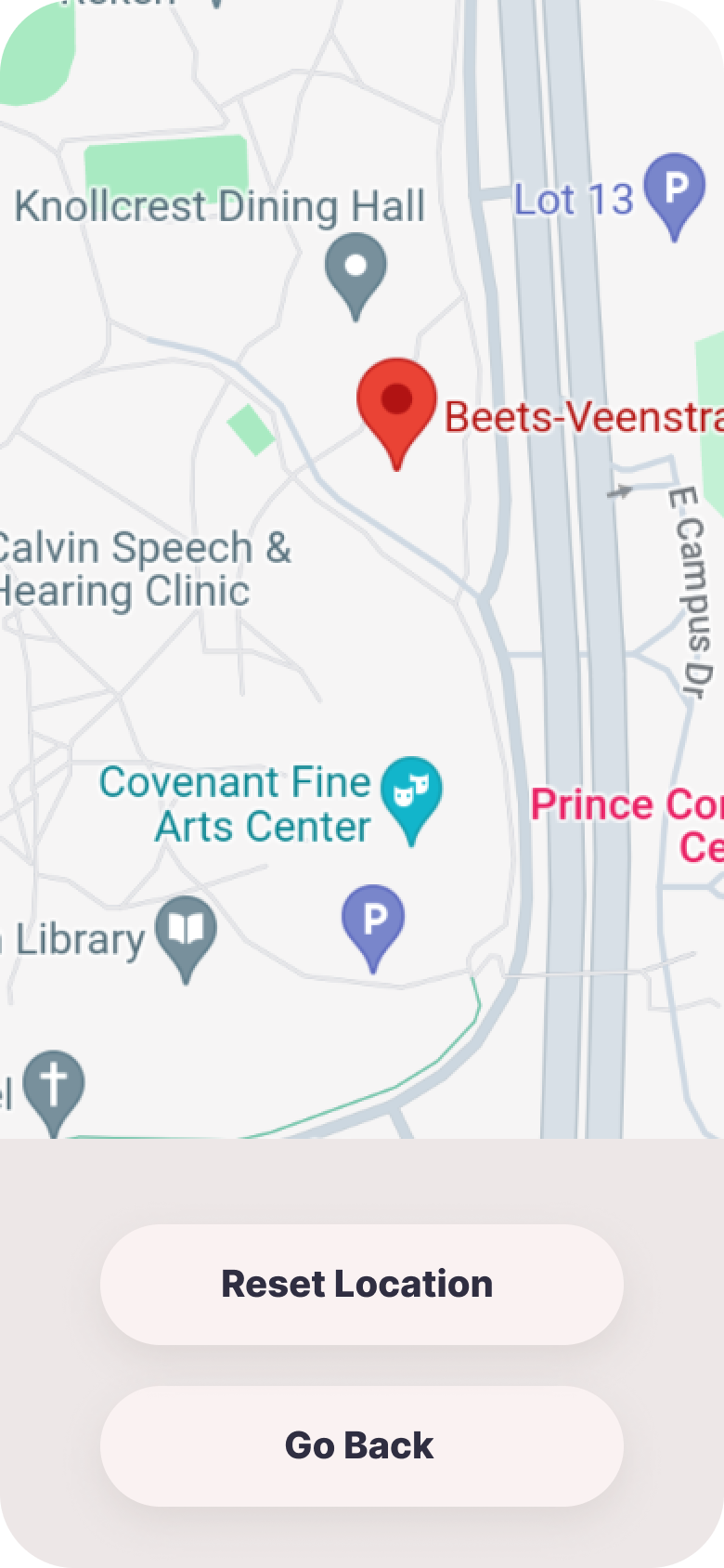
before
after
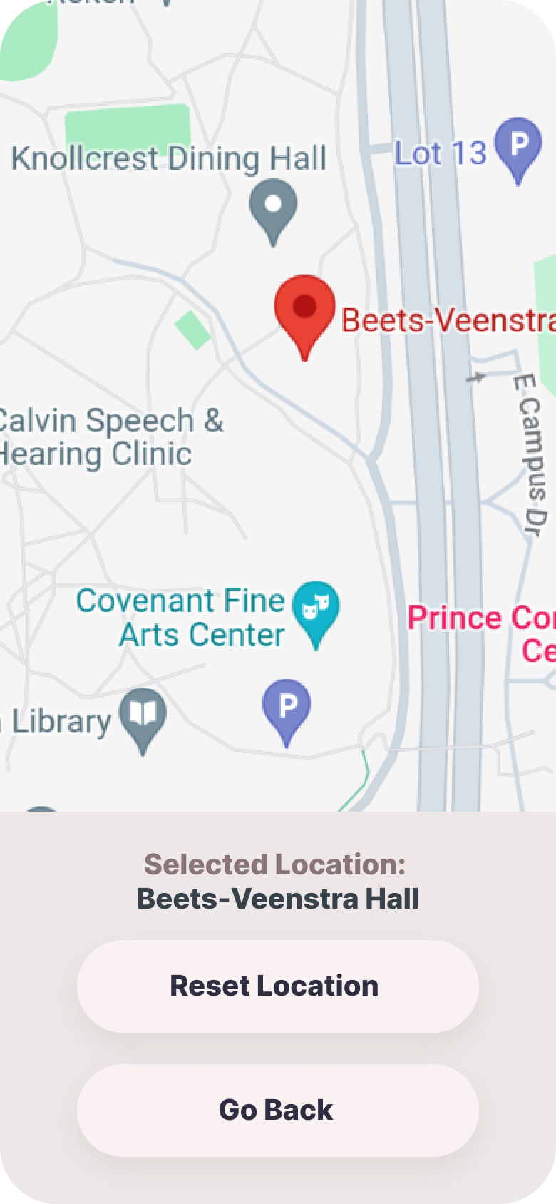
Users found it challenging to find specific locations on the map.
Action: Added description for selected location on the UI.
- App was considered aesthetically pleasing
- Main page was easy to navigate and scroll through
- Posts were easily clickable
- Users found the app helpful despite areas needing improvement
The usability testing provided crucial insights that have guided our development process, ensuring that CalvinFinds becomes more user-friendly and efficient in addressing the needs of the Calvin University community. We're committed to continuous improvement based on user feedback.
Initial UI Model
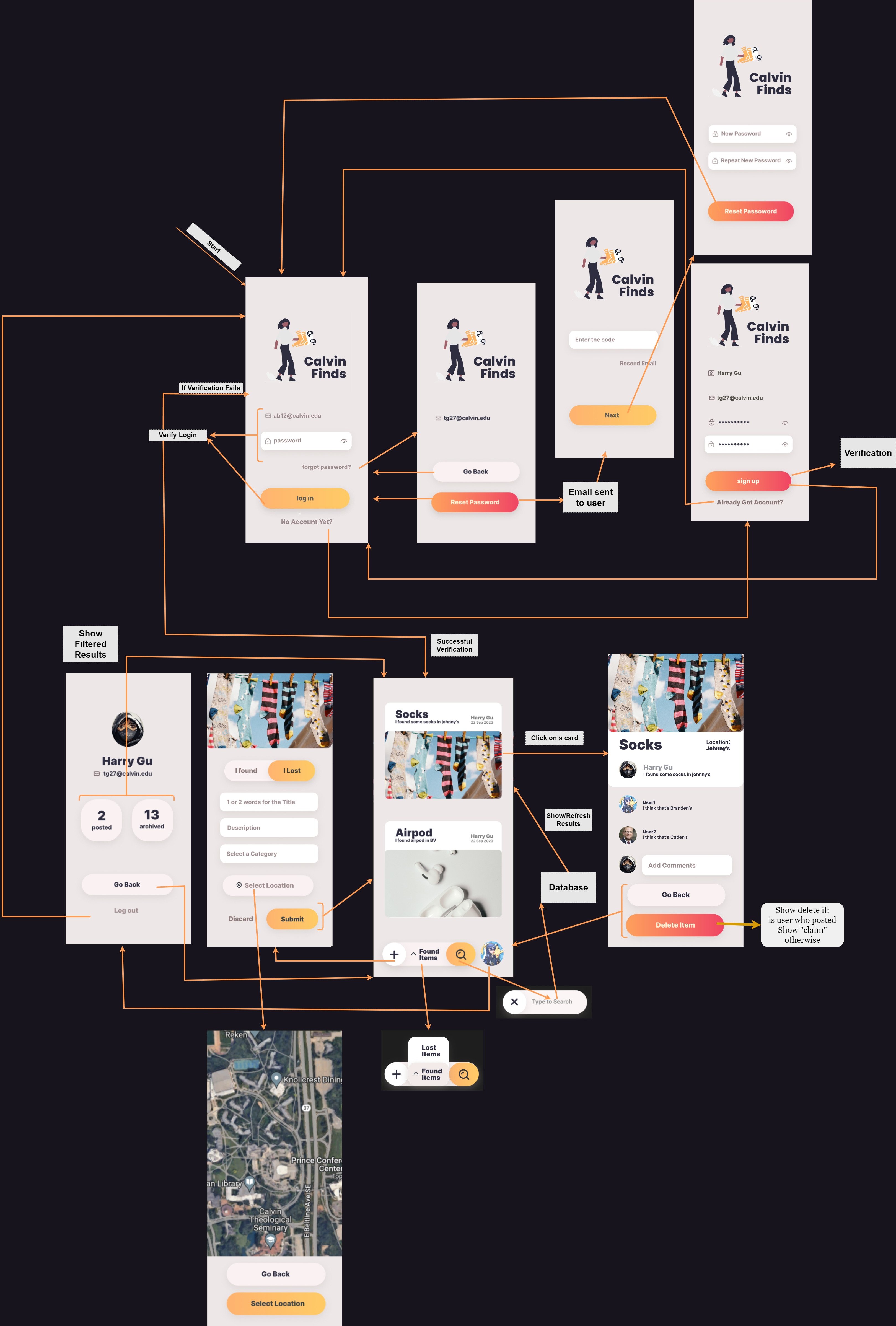
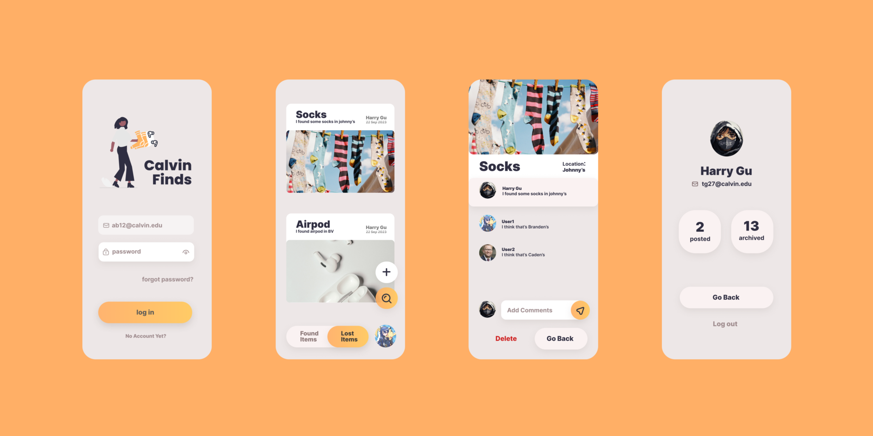
Final UI
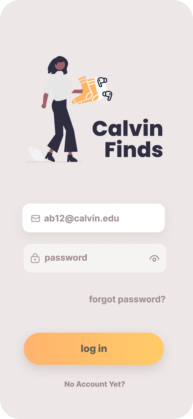
Login Page
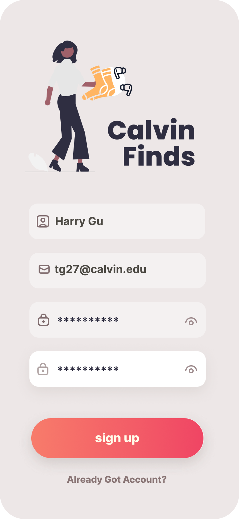
Signup Page - Filled
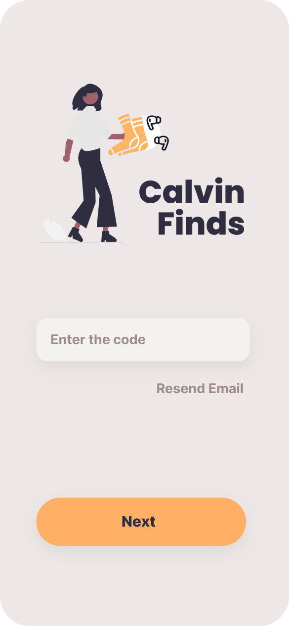
Reset Password Page - Send Code to Email
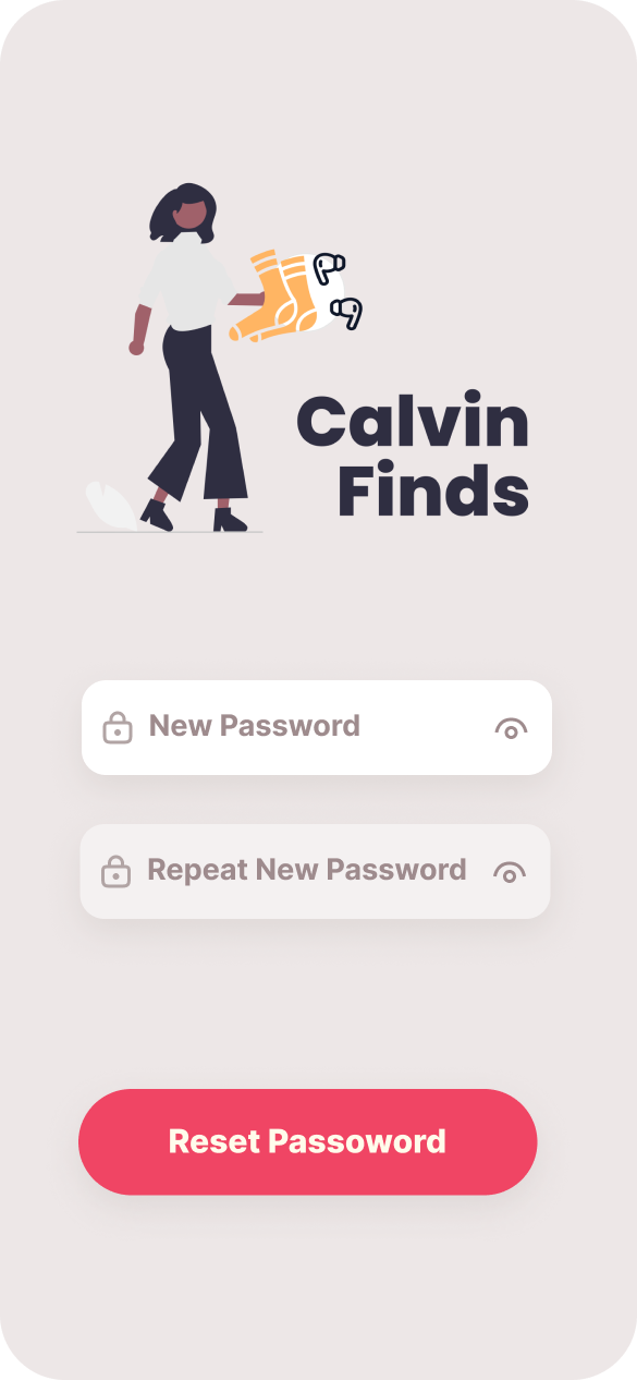
Reset Password Page - Type New Password
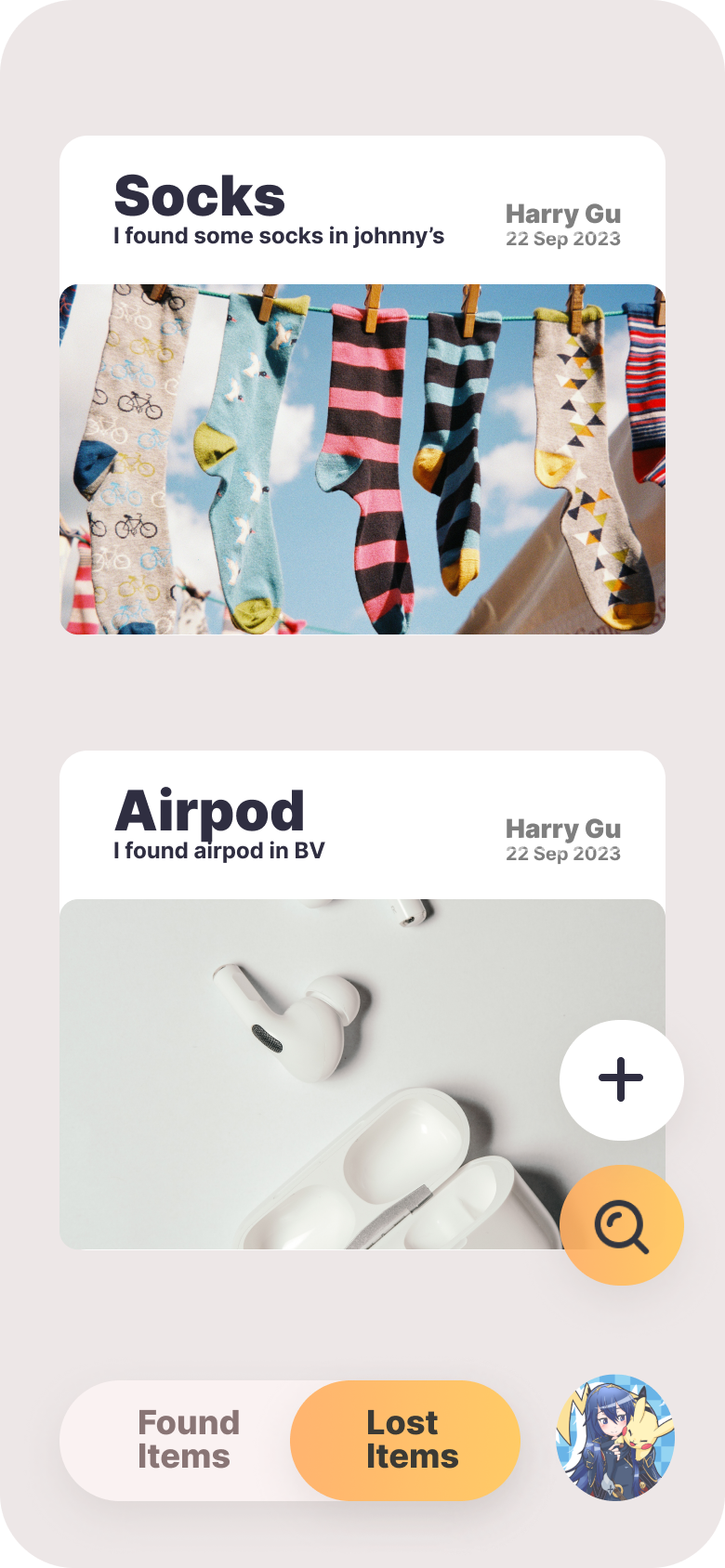
Main Page
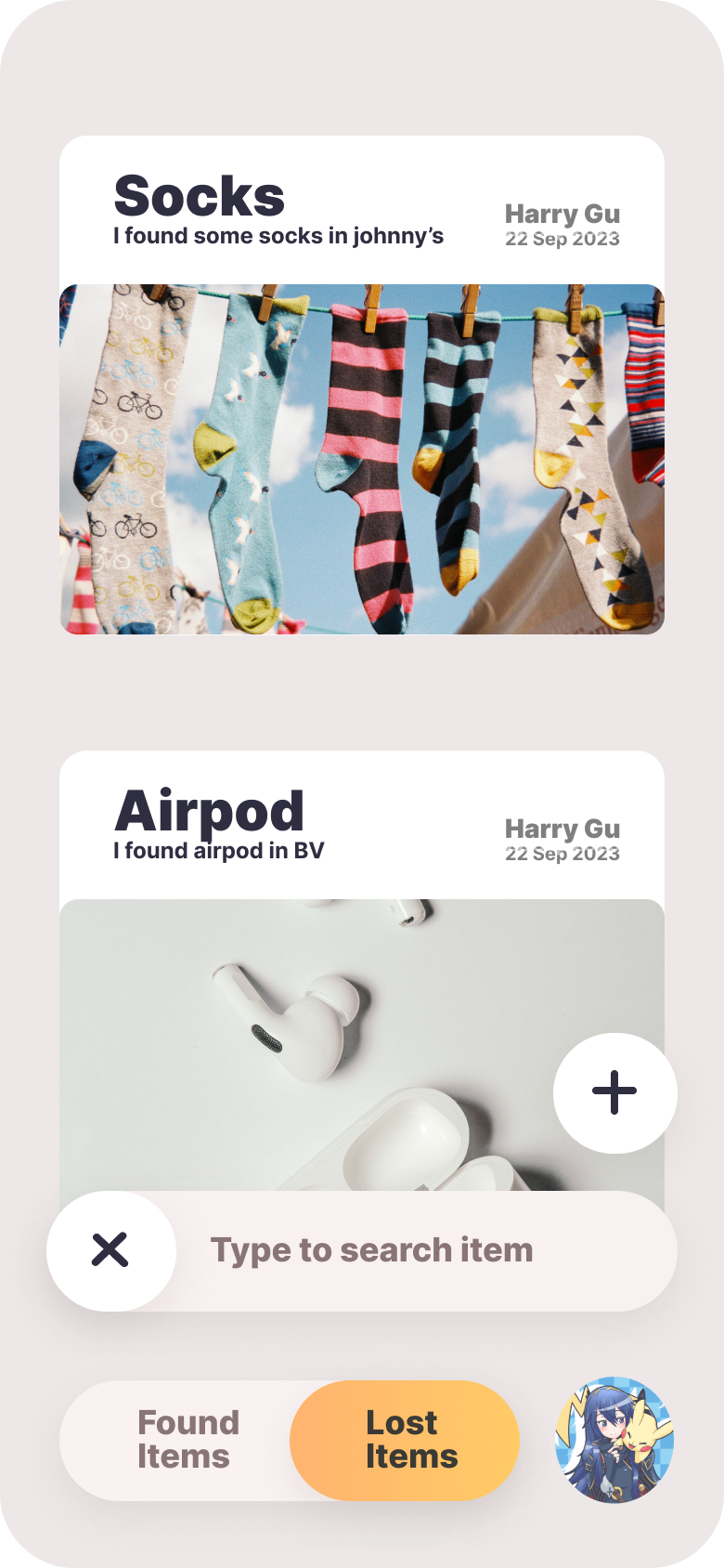
Main Page - Search Bar Activated
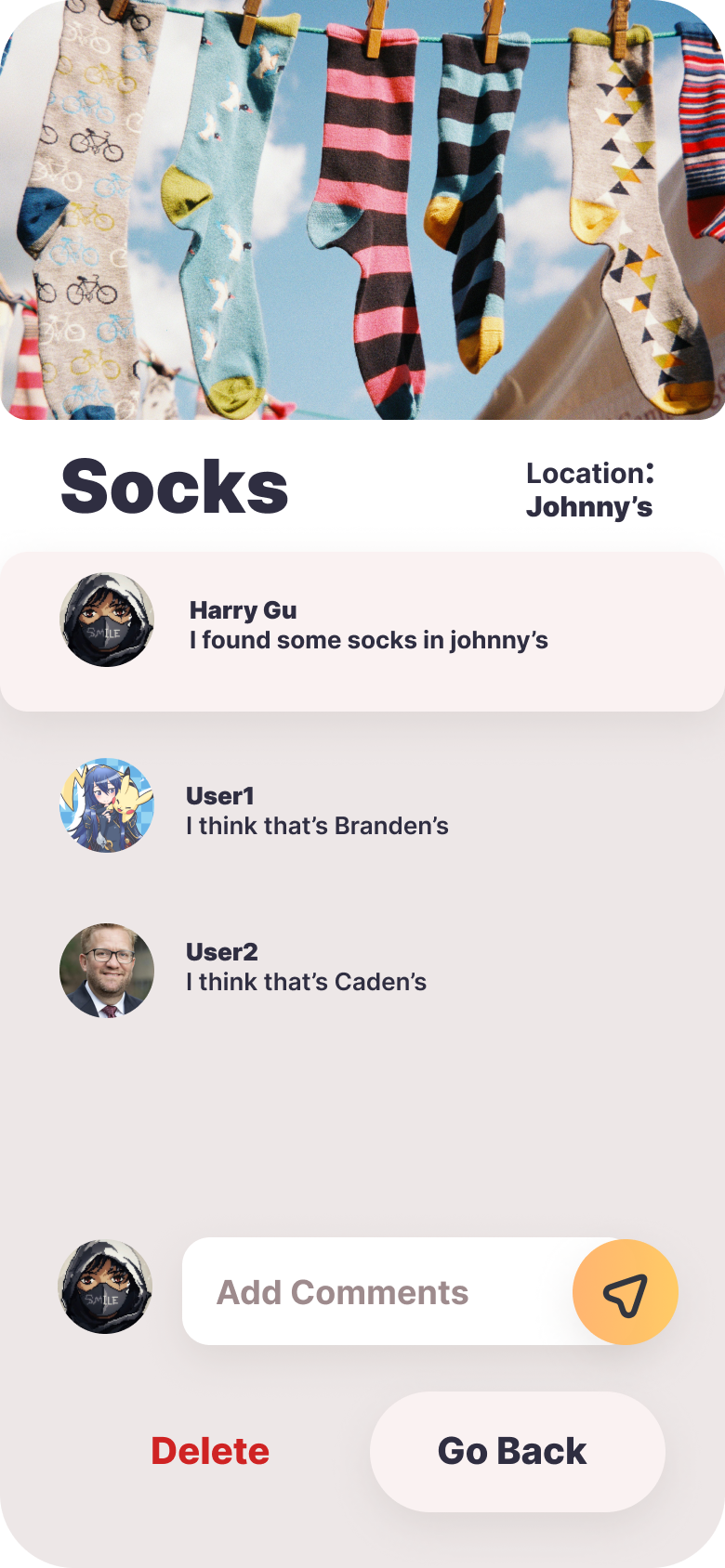
Item Details Page
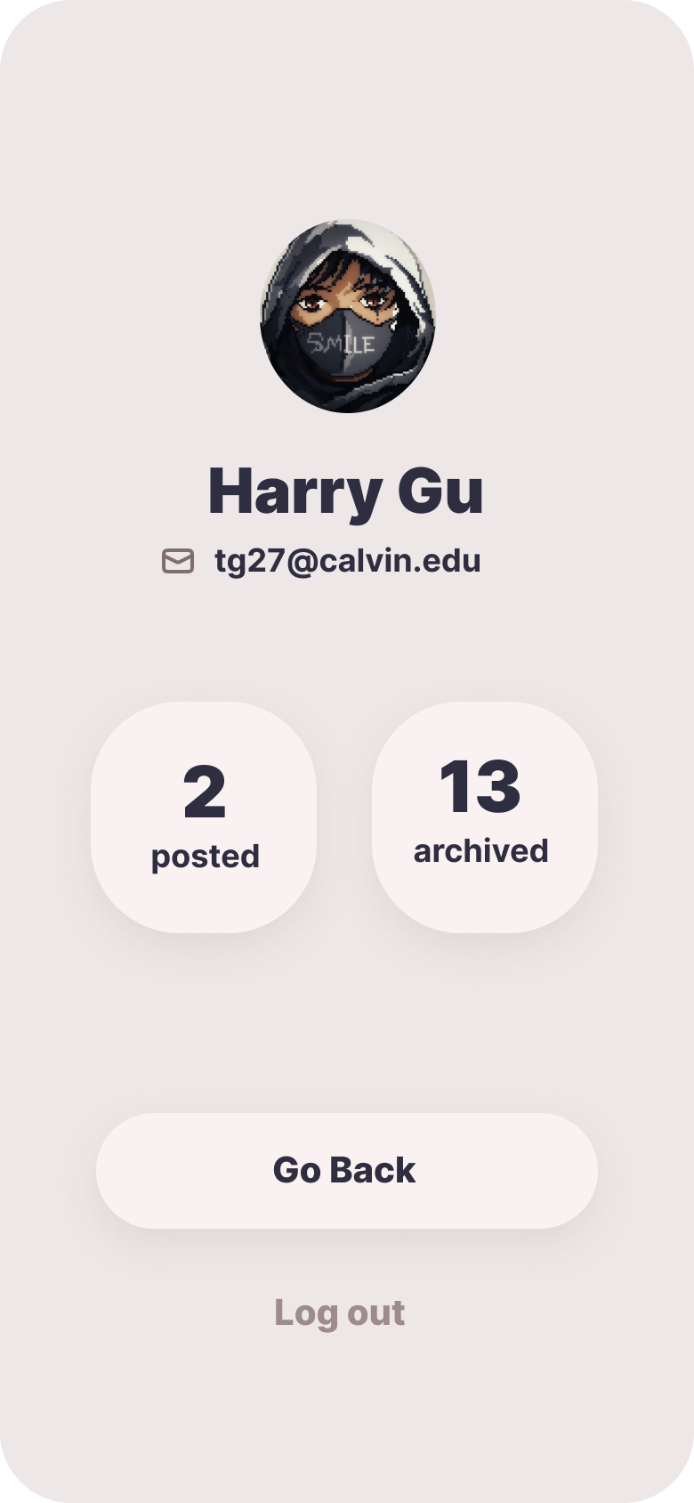
User Profile Page
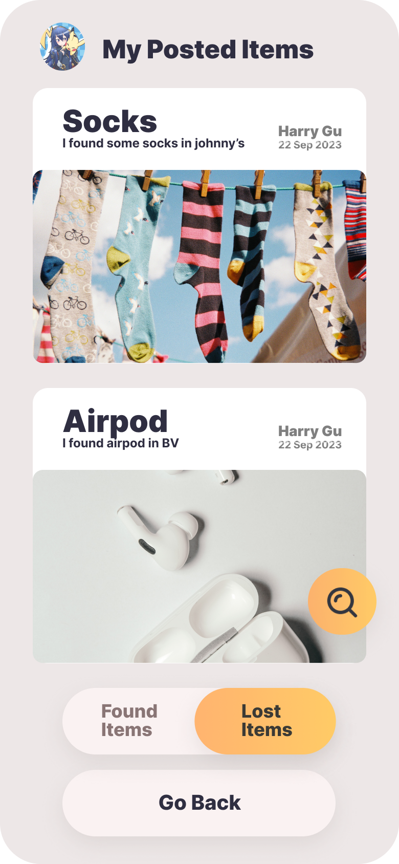
User Posted Page
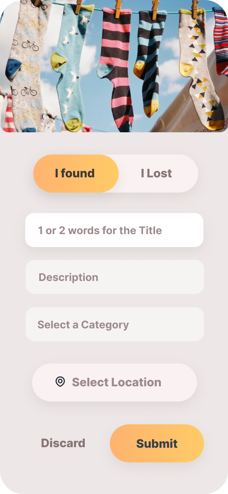
Add Item Page

Add Item Page - Map Selection
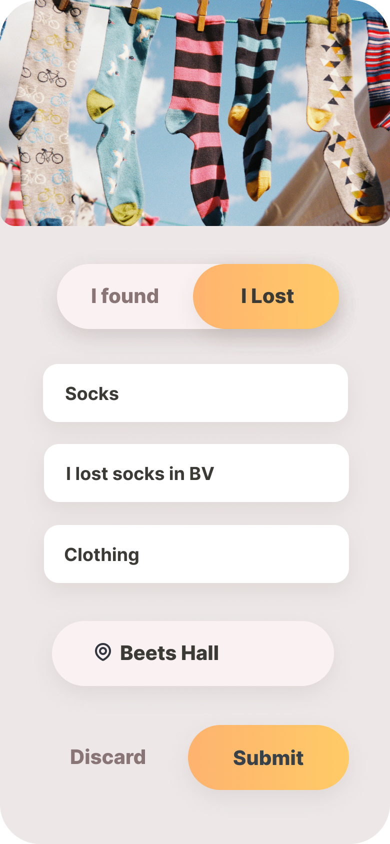
Add Item Page - Filled
Deployment Diagram
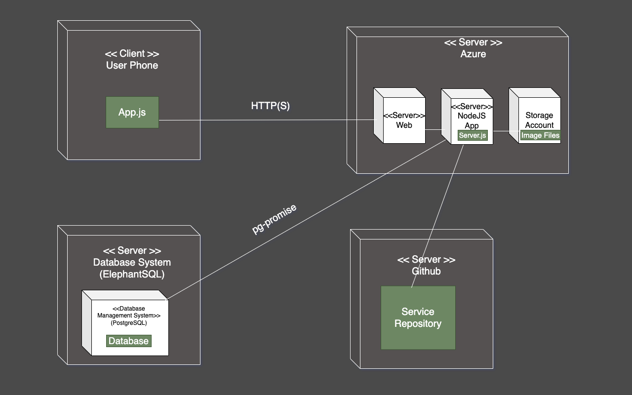
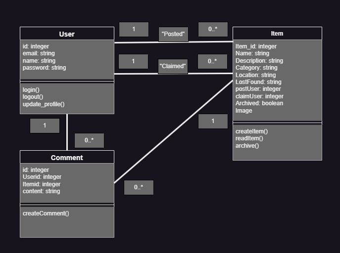
Domain Model
