State of the Detroit Child
Usability Analysis
Leinweber Consulting
Authors: Harry Gu, Nathan Schuman, Louise Depa, Mikang Moon, Zhitai Jin
Date: April 20, 2026
My role: Analyzed usability testing notes, drafted the Findings section, authored Recommendations 1 and 3, and participated in 2 of the 5 test sessions.
Executive Summary
For this project, we have been tasked by Data Driven Detroit to investigate the user engagement issues on their website, State of the Detroit Child. To gain a better understanding of these issues, we conducted usability testing of this website and its core features amongst potential users. For this, we recruited 5 individuals who fit the profile of users of the State of the Detroit Child, including librarians, several professors, and a PhD student. We tested how easily users can find certain information on the website and whether they can successfully operate it. From our tests, we attained data corresponding with our previous findings and provided us with new insights as well. During our tests, several of our testers struggled to find and operate certain features on the site, either taking more time than anticipated or failing to complete certain tasks. When the participants shared their thoughts during the test debriefs, several of them felt it was difficult and unintuitive to find and operate certain core features of the site. Based on this data, our team recommends that the State of the Detroit Child website move its interactive map to the homepage, add the “Site Tutorial” to the main navigation menu, implement filtering options on pages where data is displayed, and add more descriptive titles to pages and features. Through this, we believe Data Driven Detroit will be able to generate better engagement amongst users of their site.
Introduction
The State of the Detroit Child is a data visualization and analytics website where users can view and analyze statistics related to the conditions of children living in Michigan. The intended users of this site include non-profit workers, community leaders, policy makers, and academics. For our usability tests, we wanted to expand upon our previous findings surrounding the ease of use and intuitiveness of this site. We also determined there is a strong connection between the information architecture of these sites and how easy it is for users to operate them. As such, we determined the following key questions we used to guide this study:
- How easily can users find the core features and tools of this website?
- How quickly can these features be found, if at all?
- When interacting with these tools, how intuitive are they for users to operate?
Through attaining the answers to these questions when conducting our user testing, we believe we will be able to fulfill our team's goal of crafting recommendations for ways to make the State of the Detroit Child more engaging for users.
Methods
We recruited individuals who fit the profile of potential users of the State of the Detroit Child website. This included researchers, professors, and librarians from our university who possess experience with data visualization software and geographic information systems. The experience these individuals have working with such technology would allow them to provide invaluable data for our study. We employed “cold emailing” to recruit our testers. To attain new insights and information, we recruited different individuals from those we previously conducted interviews with. As such, we were able to recruit the following participants:
- One professor at the School of Public Health (P3)
- One lecturer at the School of Public Policy (P2)
- Two librarians at the UM library (P4) (P5)
- One PhD student (P1)
The participants of our test have all used data analytics websites for their work and research. While none of them have used State of the Detroit Child before, some of them have used other websites created by Data Driven Detroit. All of our testers described themselves as possessing moderate to advanced technical skills.
For our usability testing, we worked as a team to craft protocols to capture important data for our study. Our protocols start with:
- A recording and data use consent form.
- A preamble to inform the participant of the purpose of this test and that they can leave at any time.
We then move on to a basic questionnaire in which we ask the participant to:
- Describe their work experience.
- Discuss the software they use for work.
- Describe their level of technical proficiency.
Next, one team member provided the participant with instructions for the test while another took notes. The tasks were:
- Find the page containing the site tutorial.
- Navigate to the interactive map of Michigan.
- Use this map to find specific pieces of data, such as:
- Locate Detroit on the map.
- Find the rate of child poverty in Highland Park.
- Find the number of young adults who were without healthcare in 2017.
- Find a specific existing geographic data set created by another user
- Create a data set of their own using the interactive map.
- Go to the methodology pages of the site to view the data sources.
Following the test, we asked them a series of follow-up questions. For this, we asked the participants to share their thoughts regarding their experience using this website, such as what they liked about the site, what they didn't like, and what, if anything, they would change about it.
When we conducted pilot testing of our protocols, we found many of our tasks are interdependent upon each other. If a user failed a task that involves them navigating to a certain page, they wouldn't be able to proceed with following tasks requiring them to be on that page. To prevent us from losing crucial data, if a participant failed to find a certain page, we would make a note, and then guide them to this page to allow the test to continue.
Tests were held over Zoom to make participation convenient. We had participants share their screens during their test and think aloud while completing tasks. Zoom's video recording and transcription features were paired with manual note-taking to capture as much data as possible.
Findings
Our findings from reviewing our notes and data from our tests include:
Some participants expressed frustration over the design and layout of certain pages. They felt it made navigating through pages cumbersome:
“Have to go to three different places on the screen, 2 different search bars, one button at the bottom. Prefer all data related to filtering in one area to find.” (P1)
“Big icons just jumping to different sections of the Detroit data page can be confusing.” (P2)
Many testers were confused and somewhat overwhelmed by the homepage. They felt it was hard to navigate to other pages on the site from it and instead wished certain features on other pages were consolidated there.
“where do I actually start?” (P4)
“Big icons just jumping to different sections of the Detroit data page can be confusing.” (P2)
P4 explicitly wanted the interactive map on the first page while P2 wanted the tutorial there as well.
Certain tools and features were hard for users to find and operate. Participant 1 felt the “Over Time” button on the map/data page is difficult to locate.
(P1: “Find the overtime button in 50 sec, find the data in 1 min and 10 sec.”)
It took participant 5 longer than anticipated for him to find this feature as well. (P5: “Notices over time button after 1 min”) Several participants also struggled with creating their own geographic data sets, with participants 3 and 4 failing this task.
Several testers were confused by the language and wording used throughout the site. They were confused by the titles used to describe certain pages and tools. Participant 4 was confused by the title “Custom profiles” for the page to view data sets made by other users. Participant 5 was confused by the title for the page “Explore by topic” because
“it's not exploring by topic but exploring the context of the data.” (P5)
Participant 4 was confused by the title “Additional resources” and expected it to lead to the tutorial page. (P4)
Participants 5, 4, and 1 struggled with navigating through the data sets listed below the interactive map of Michigan. It took them longer than expected to scroll through all of the data displayed to find what they were looking for. It wasn't apparent to them that there is a drop-down menu that allows them to navigate faster.
Recommendations
Based on these findings, we will present Data Driven Detroit with the following recommendations:
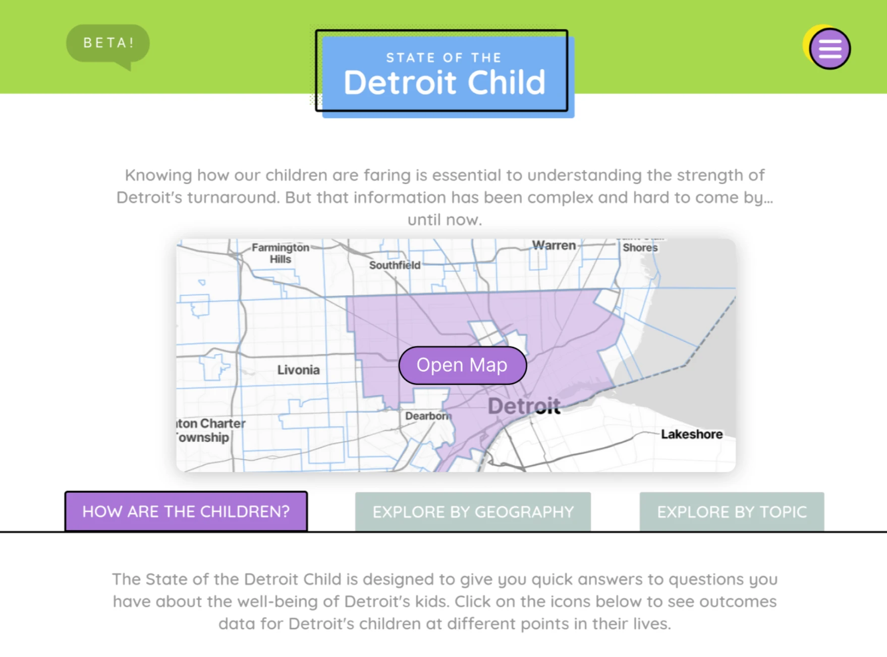
Move the interactive map of Detroit to the homepage. Several participants were dissatisfied with the content on the homepage and felt it was difficult to navigate from it to important features on the site. This can be remedied by moving the map to the homepage. This aligns with our previous findings that featuring such content here is industry standard, as shown by the homepage from another analytics site we previously analyzed.

Below is a mockup of how the site's homepage could potentially look if this suggestion is implemented.
Putting a link to the “Site Tutorial” in the hamburger menu. Participants 3 and 5 attempted to find it there during their tests. Doing so would make this page more accessible and assist users with figuring out how to use site tools more effectively.
On the Data/Map page, make the “Jump to a section” dropdown sticky on top. Instead of having users scroll through all of the data, sticky links would allow them to efficiently find whatever they're looking for as shown below.
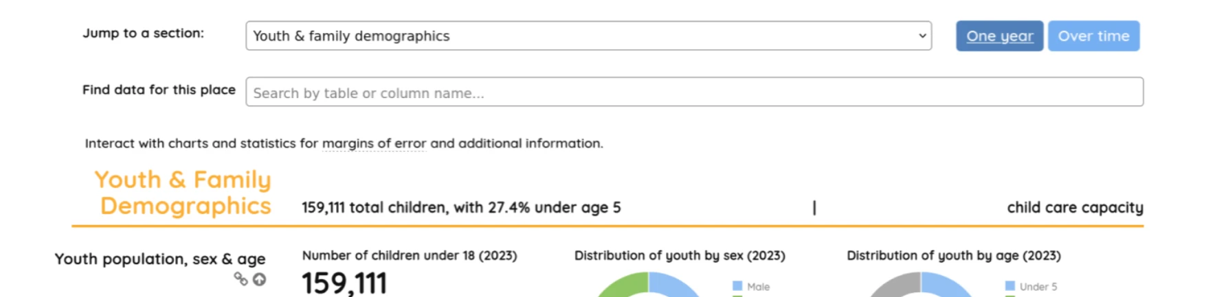
(“Jump to a section” can remain in the same location if the user does not scroll down)
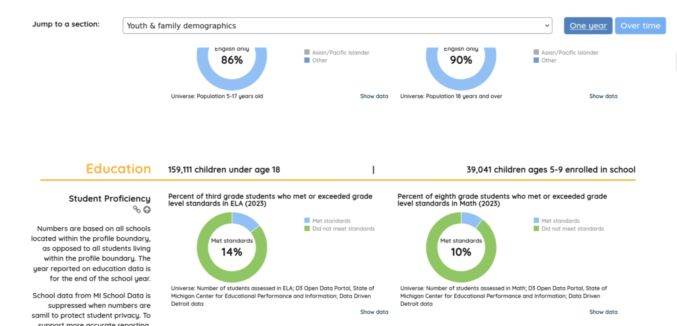
(“Jump to a section” becomes sticky on top after the user scrolls down)
Use more descriptive language for the titles of pages and tools. Renaming these features and pages to reflect their actual content will help users navigate the site and use its tools more effectively. (Such as Rename “Topics” to “Methodology”, rename “Custom profiles” to “User Created Profiles.”)
Group filtering buttons together. Put the “One year / Over Time” buttons grouped with the “Jump to a section” buttons to make navigation through data easier. Please the screenshot below for a mockup of how this might look:
Discussion
One of the major shortcomings of this study was the technical capabilities of the participants involved. As previously mentioned, all of our testers were very technically savvy individuals. This might skew the data from this study since the typical user of this site might not possess such technical skills. As such, the next steps for Data Driven Detroit would be for them to conduct this test themselves, but with individuals they believe are more indicative of the average user of their site.
Task Performance Data
| Task Number | Participant 1 | Participant 2 | Participant 3 | Participant 4 | Participant 5 |
|---|---|---|---|---|---|
| 1 | Pass 15 sec | Pass 11 sec | Pass 28 sec | Pass 31 sec | Pass 5 sec |
| 2 | Pass 30 sec | Pass 1 min | Pass 55 sec | Pass 23 sec | Pass 20 sec |
| 3 | Pass 2 min 25 sec | Pass 45 sec | Pass 56 sec | Pass 42 sec | Pass 1 min 30 sec |
| 4 | Pass 1 min 10 sec | Pass 55 sec | Pass 30 sec | Pass 2 min 3 sec | Pass 1 min 30 sec |
| 5 | Pass 40 sec | Pass 40 sec | Pass 33 sec | Fail 2 min 21 sec | Pass 1 min 24 sec |
| 6 | Fail 50 sec | Pass 5 min 50 sec | Pass 2 min 30 sec | Pass 46 sec | Pass 4 min 34 sec |
| 7 | Pass 10 sec | Pass 30 sec | Pass 1 min 30 sec | Fail 2 min 10 sec | Pass 30 sec |
Contribution Statement
Harry Gu: I primarily analyzed usability testing scripts and wrote the findings and recommendation section based on findings from participant quotes. I modified some of the recommendations section. I also wrote the discussion section. I participated in two usability tests.
Nathan Schuman: Recruited 4 out of 5 of our testers. Administered our first test and took notes during the second. Wrote the initial rough draft of this report and participated with my teammates in editing it.
Mikang Moon: Participated in two usability testing sessions. I helped write the recommendations section. I created presentation slides and recorded presentation.
Louise Depa: I participated in two usability testing sessions (one as a notetaker, and another as the administrator), helped edit the document, and created the appendices section.
Zhitai Jin: I participated in three usability testing sessions and helped write the recommendations section.
AI was not used in the creation of this report.