ReentryGuide GR
Fixed 2 critical navigation blockers, the app deployed to community pilot group, the app's posters displayed at Michigan Department of Corrections (MDOC) parole office in Grand Rapids.
Technology
React Native, Docusaurus, Figma, Inkscape, Krita
Service
Software Development, UX Design, User Research, Usability Testing, Deployment, Web Design, Graphic Design, Logo Design, Digital Illustration
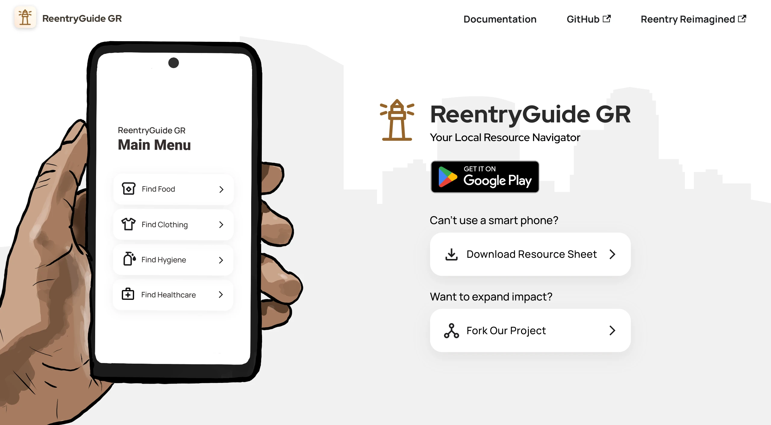
"ReentryGuide GR" is a mobile application developed in collaboration with Reentry Reimagined, designed specifically to support the reintegration of former prisoners into society within the Grand Rapids area.
Designing With, Not For
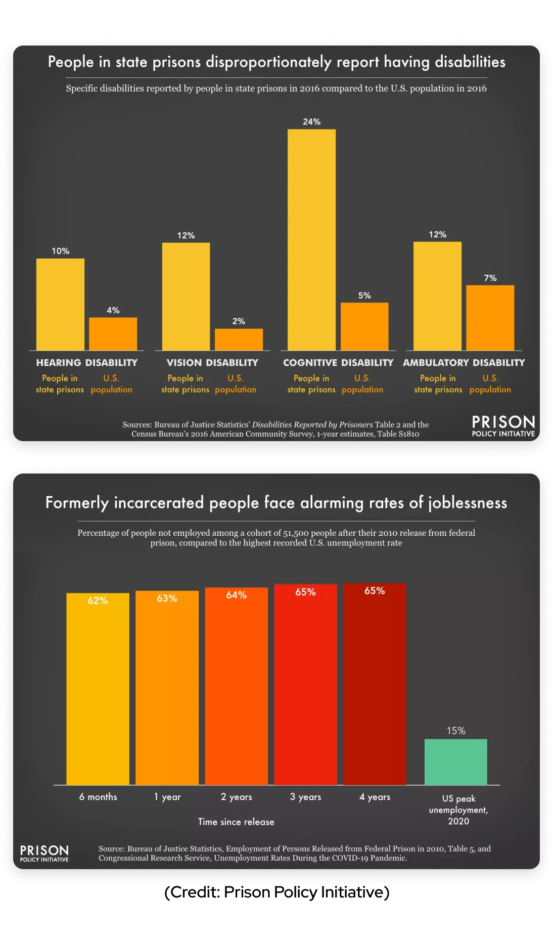
To design with formerly incarcerated individuals, I didn't start with wireframes. I started by showing up. For 3 months, I voluntarily attended weekly meetings with C.L.E.A.R., a community group of 20+ formerly incarcerated people in Grand Rapids. I listened to their stories, learned that many had never owned a smartphone before and during prison, and discovered that some had cognitive disabilities that made complex navigation overwhelming. By the time I opened Figma, I wasn't designing for an abstract "user with low digital literacy." I was designing for people I knew by name.
The Challenge
A local non-profit organization "Reentry Reimagined" needed a mobile app to help formerly incarcerated people navigate to locations that provide crucial resources for their survival, such as food, clothing, hygiene, and healthcare.
User Research
Our user research focused on understanding the unique needs and challenges of our target audience: formerly incarcerated individuals seeking crucial resources.
Key Findings
• Demographics
Our users come from diverse backgrounds and varies in age, but share the experience of reintegrating into society after incarceration.
• Environment
Many of our users navigate high-stress environments daily, dealing with uncertainties in housing, employment, and social reintegration.
• Technology Experience
A significant portion of our user base has limited experience with modern smartphones and apps.
• Cognitive Abilities
Some users have various cognitive disabilities, requiring special consideration in our design approach.
Inclusive Design Approach
Our users included people with cognitive disabilities, limited smartphone experience, and motor difficulties. Every design decision prioritized their needs:
- Reduced Cognitive Load: Limited options per screen to minimize overwhelm
- Motor Accessibility: Large buttons spanning full screen width, placed in thumb zones for one-handed use
- Visual Clarity: High contrast (WCAG AAA color compliance), large text (17px minimum), clear visual hierarchy
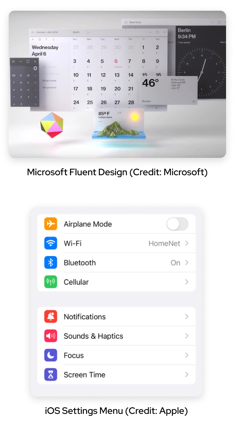
- Familiar Patterns: Hybrid of iOS and Fluent Design for users who might recognize settings-menu patterns
- Icon + Text Pairing: Every button combines icons with text labels to aid comprehension
- Shadow Indicators: Buttons have shadows to clearly indicate "clickability" for users unfamiliar with flat design
UI/UX Design Research
Visual Design Approach
- We opted for a calm, soothing visual design to provide a sense of stability for users navigating potentially stressful environments and coping with past traumas.
- This decision was directly informed by our user research, which highlighted the high-stress situations many of our users face daily.
Why Hybrid iOS + Fluent (Not Material Design 3)
We evaluated iOS, Fluent Design, and Material Design 3. We rejected Material Design 3's flat aesthetic because our users, many unfamiliar with modern smartphones, needed clear visual depth cues to understand what was clickable. We adopted a hybrid of iOS settings patterns and Fluent Design's depth emphasis, creating immediate clarity for first-time smartphone users.
Design Choices:
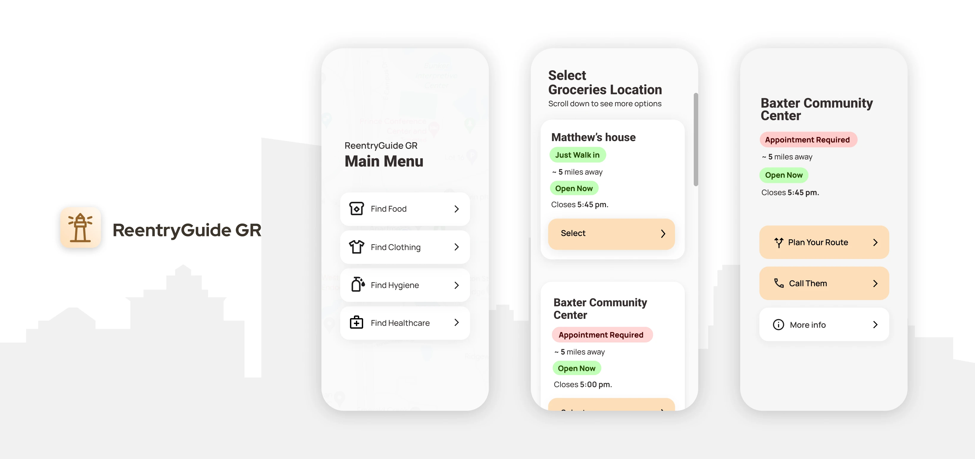
- Straightforward and Streamlined process: when the user needs something like food or clothing, we want to help the user to get to their desired locations with few clicks and without extra effort.
- Limited Options on one page: Reduce cognitive load and make sure a Simple and straightforward process.
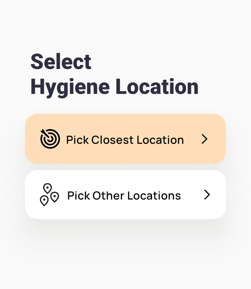
Highlighting the most likely choice with limited options by the user ensures a streamlined user experience
- Accessible Placement: Buttons located in the middle or lower half of the screen, making it easier for users to reach with minimal hand movement
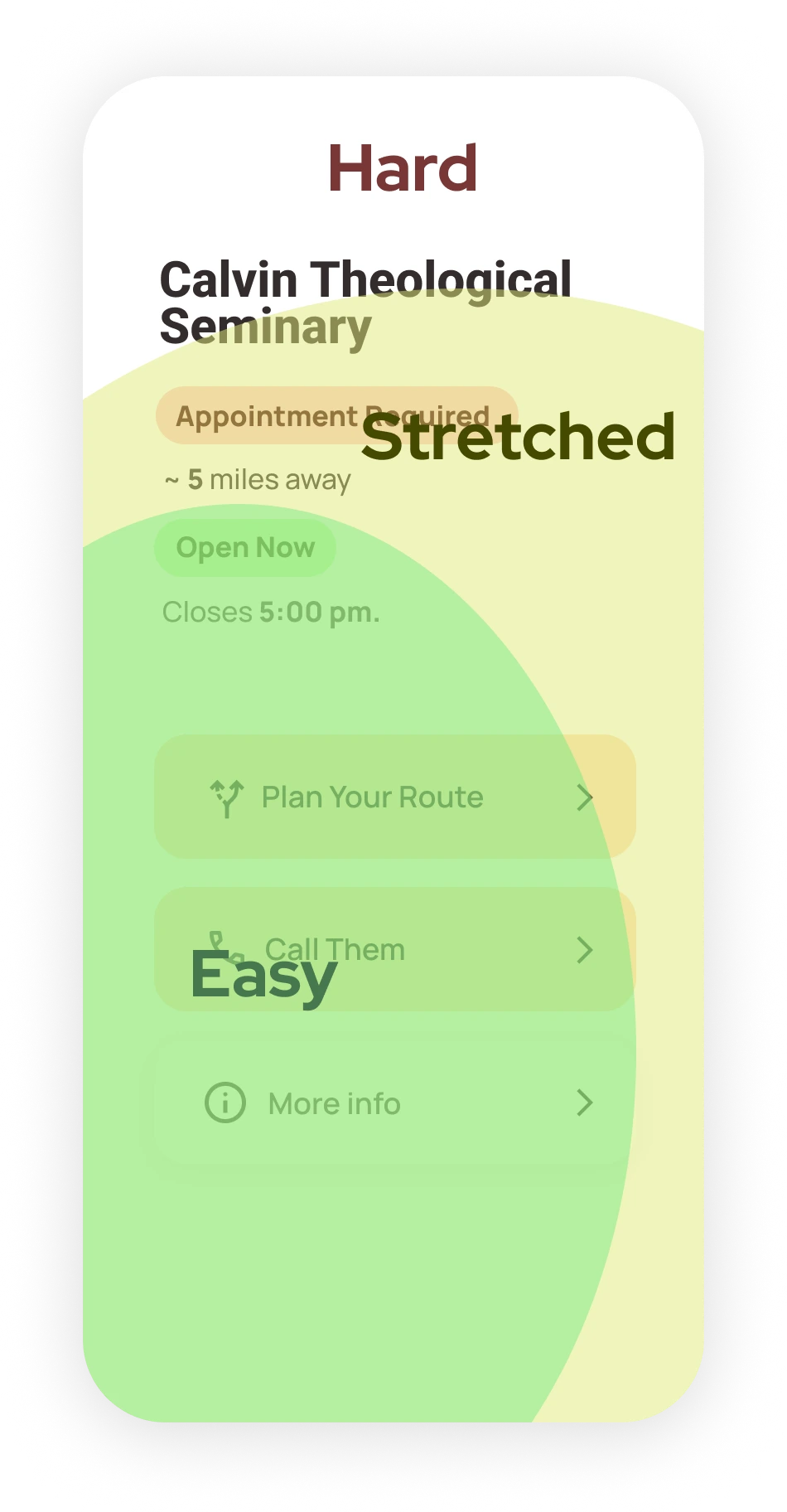
Thumb zone for left handed people
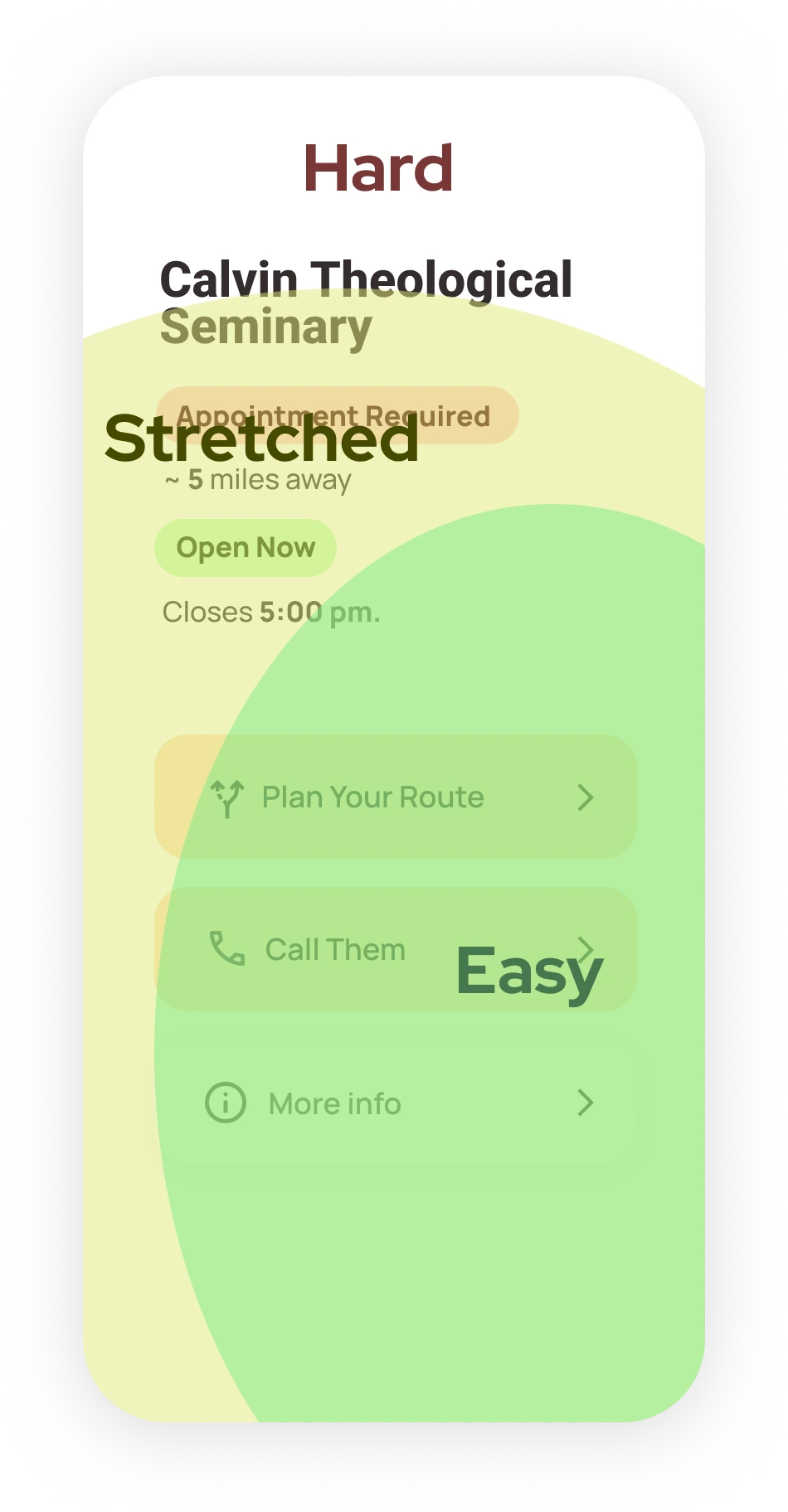
Thumb zone for right handed people
- Buttons: Large, clearly defined with shadows to indicate 'clickability', with unified style across the app to avoid confusion.
- Combining Texts with Icons: Aid understanding
- Font: Manrope, which is similar to Product Sans as regular font, increasing the familiarity to Google Maps.
- Big Texts: Font size should be at least 17px to ensure readability, especially for users with visual impairments

- Color Scheme: Light, Neutral color like #FCFCFC as background color, #FDDEBA as primary button color to ensure brand consistency with Reentry Reimagined.
- High Contrast: Ensuring all components are WCAG AAA compliant.
Component Library
Documented typography scale, color tokens, and reusable button patterns to ensure consistency and accessibility across all screens.


Usability Testing
We conducted thorough user testing to ensure our app meets the needs of our diverse user base. Our testing group included:
- 40s male, formerly incarcerated (2 years ago), homeless, limited smartphone skills
- 50s male, formerly incarcerated (1 year and 7 months ago), has autism
- 30s male, homeless, limited smartphone skills
- 30s female, homeless
- 40s male, formerly incarcerated (2 months ago), limited smartphone skills

Ferguson Apartments in Grand Rapids Downtown: One of the usability testing locations
Key Insight: Testing with Neurodiversity
"When a participant with autism struggled to understand when locations were open or closed, we changed from horizontal to vertical alignment and rewrote the timing language to present tense. The confusion disappeared in round 2."
Testing Methodology
Implemented iterative usability testing process
- Conducted two rounds of evaluations
- Used different participants for each round
- Analyzed results and adjusted the app after each round
Testing session setup:
- Met participants near their homes or location of their choice for comfort
- Provided a testing phone with preloaded app
Key Findings
Positive Outcomes:
- Font Readability: All users found the chosen font comfortable to read.
- Clear Navigation: The app's navigation structure was intuitive for all users.
Areas for Improvement:
- 1. During the first round of testing, we found that the users with autism (User No.2) and the ones less familiar with smartphones (User No.1) found the timing and open/closed status confusing.
- Solution: We changed the alignments of the elements from horizontal to vertical and the wording to present tense. We did not find this confusing anymore in the second round of usability testing.

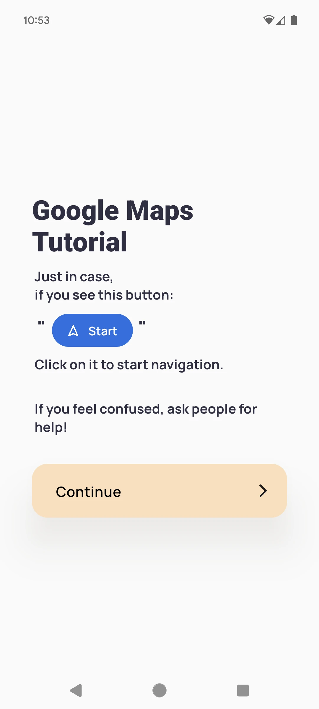
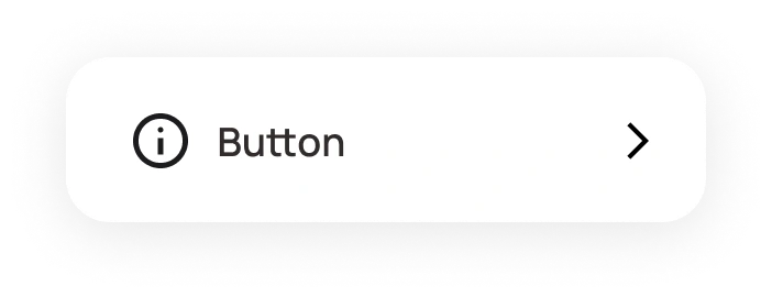
- 2. During the first round of testing, we found that the users with autism (User No.2) got lost in Google Maps and did not click on the blue "start" button to start the navigation.
- Solution: We added a simple page to remind the user to click on the start button, before our app opens the google map only for the first time.
- 3. In the second round of usability testing, the bus option in Google Maps confused users with limited smartphone experience.
- Future Plans: We are planning to shoot a video guide for how to use Google Maps Bus routes, and link the video into the app.

Final UI
ProminentDisclosure.js
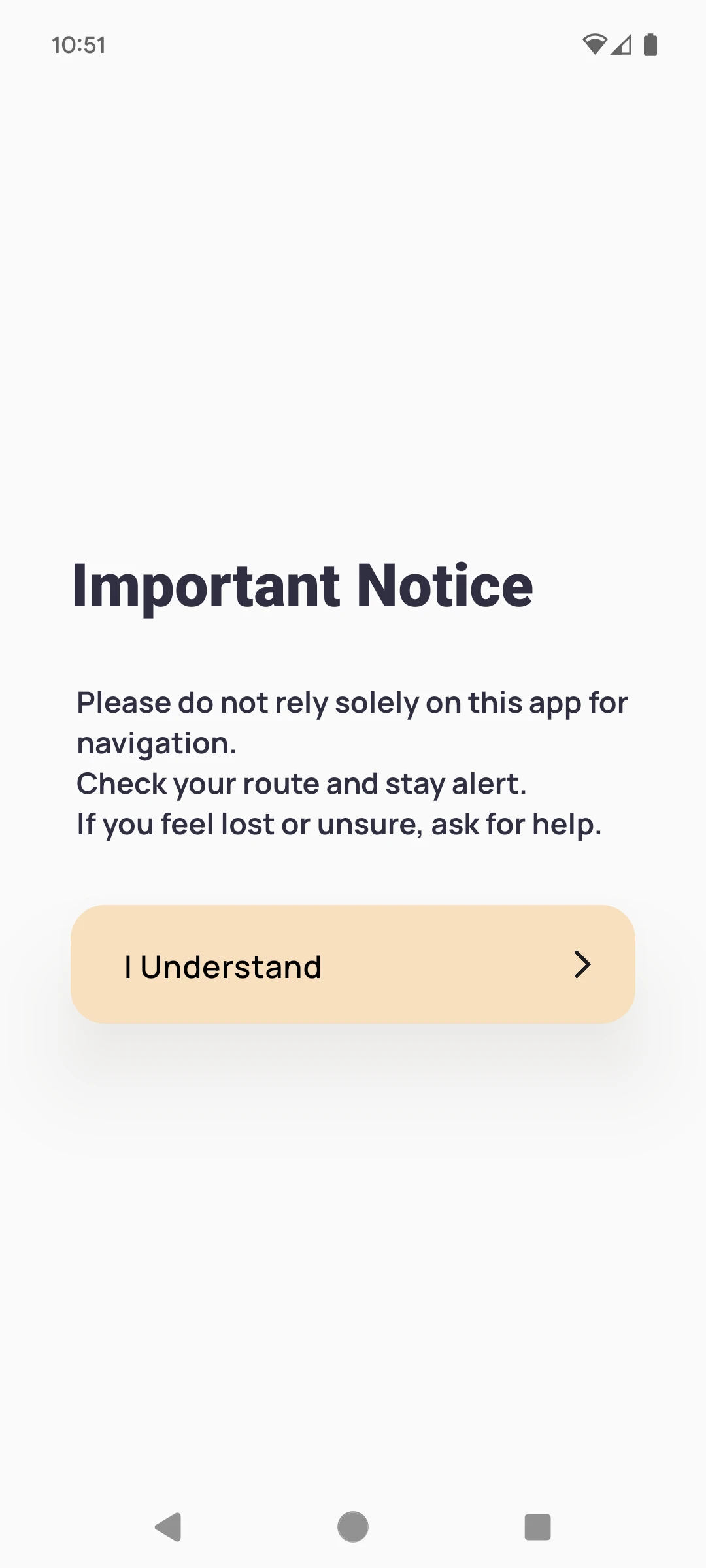
ImportantNotice.js
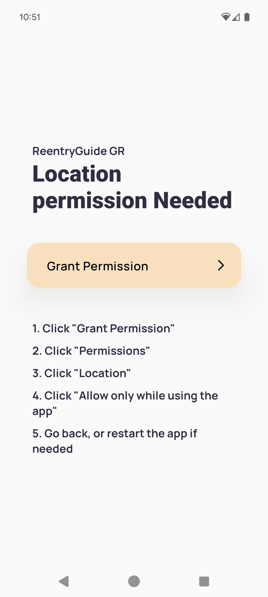
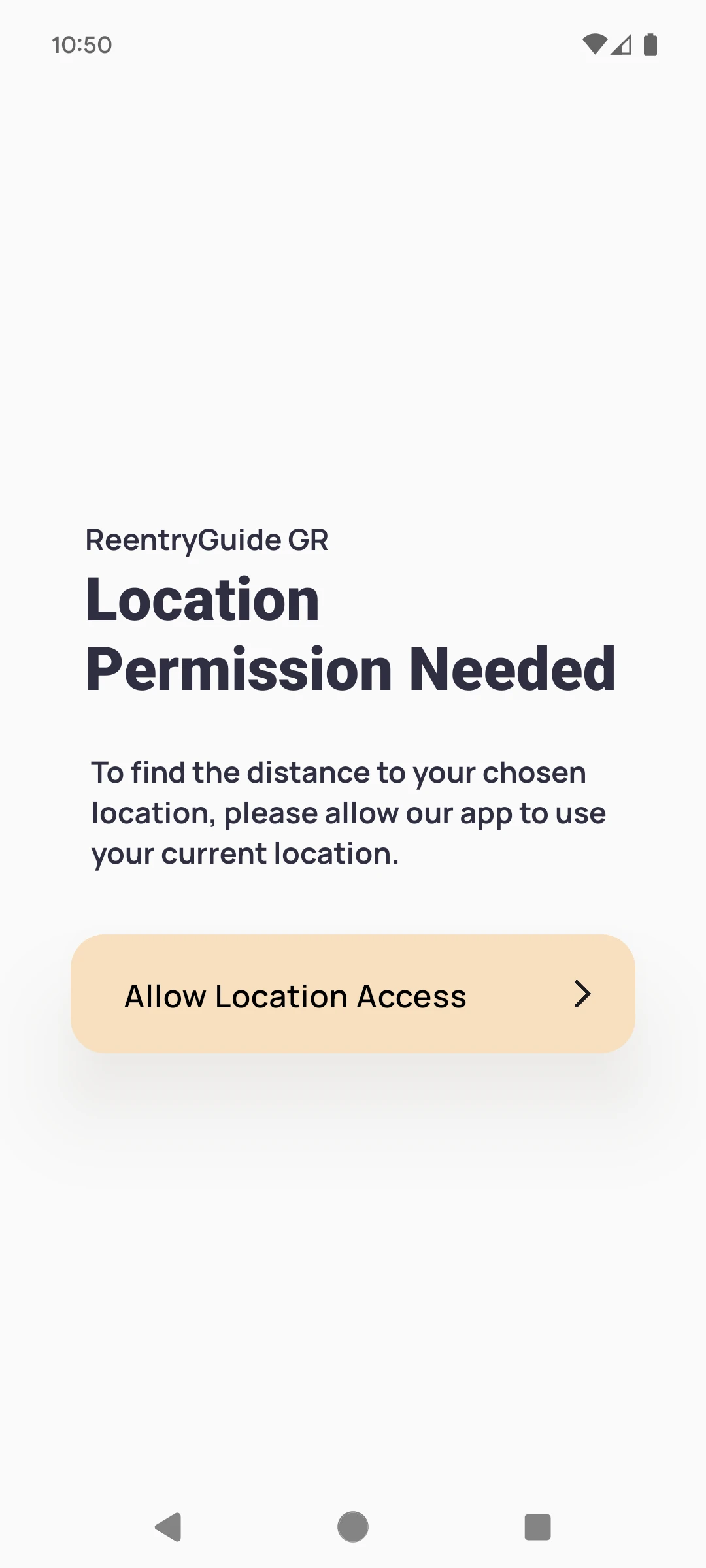
RequestPermission.js
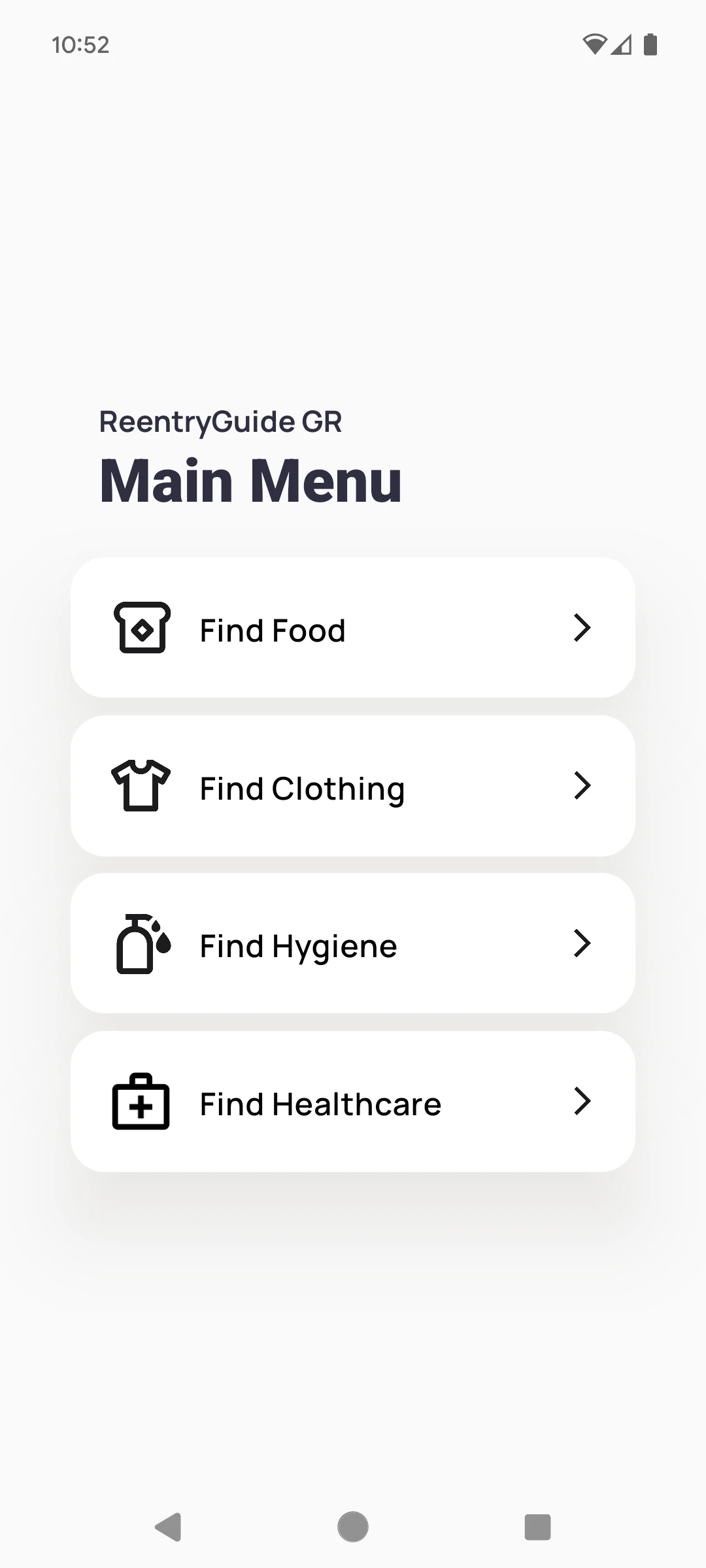
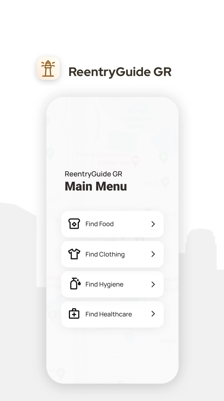
MainMenu.js
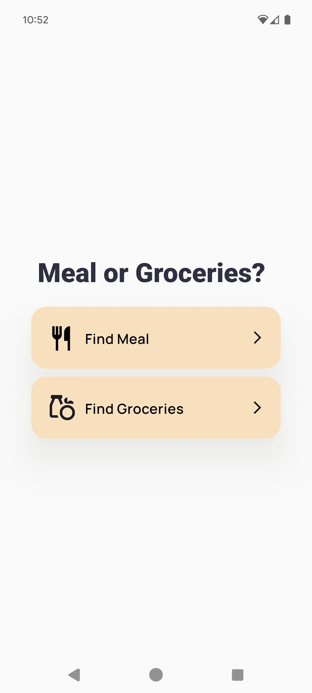
MealOrGroceries.js
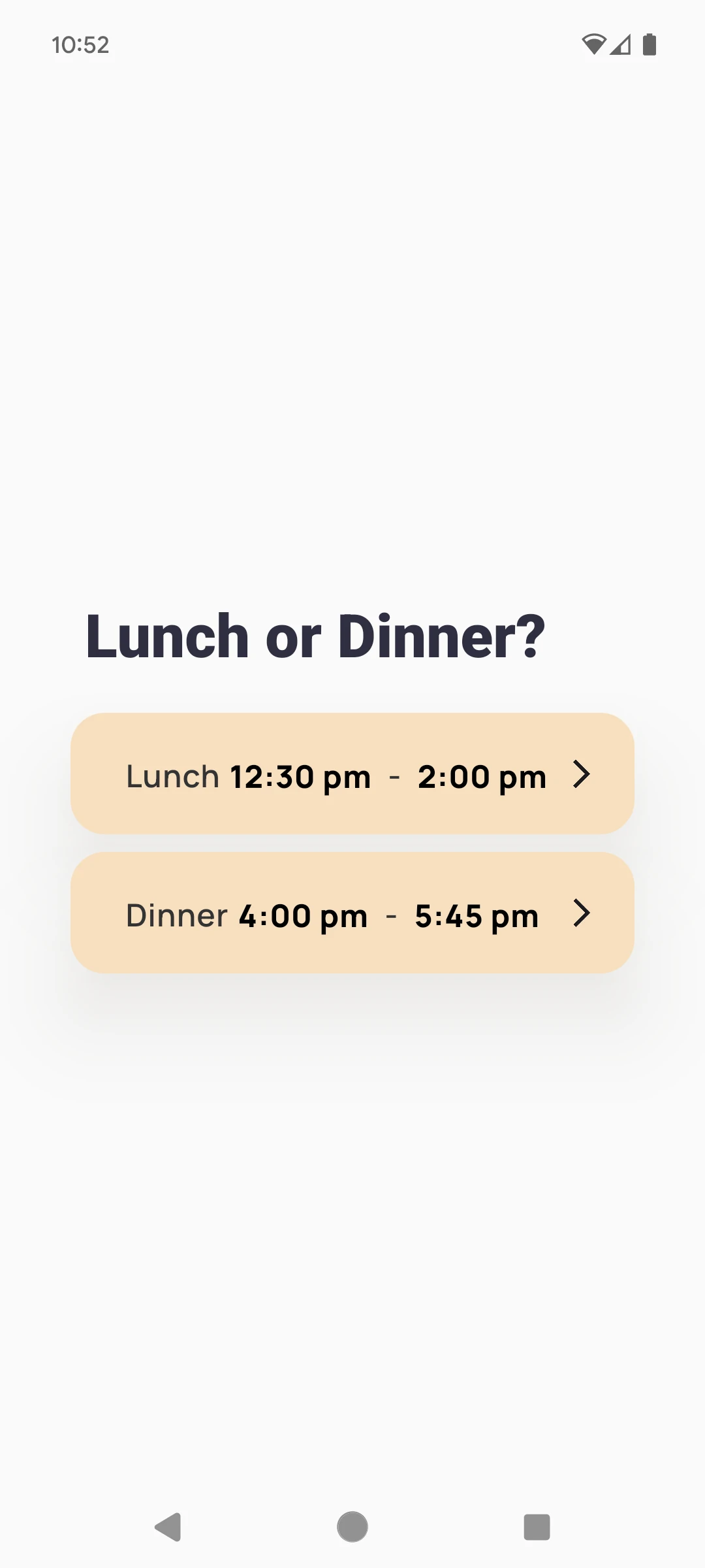
LunchOrDinner.js
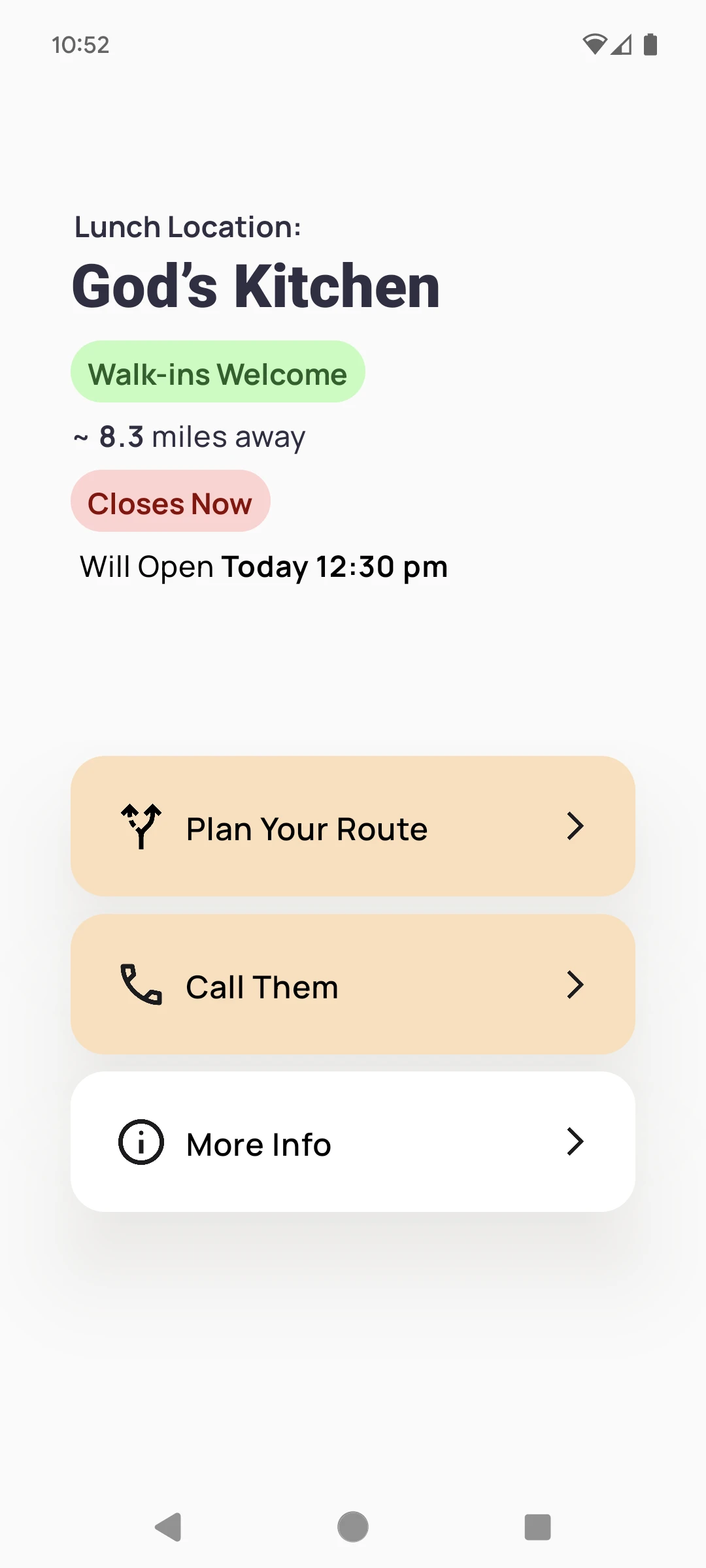
ResourceLocation.js
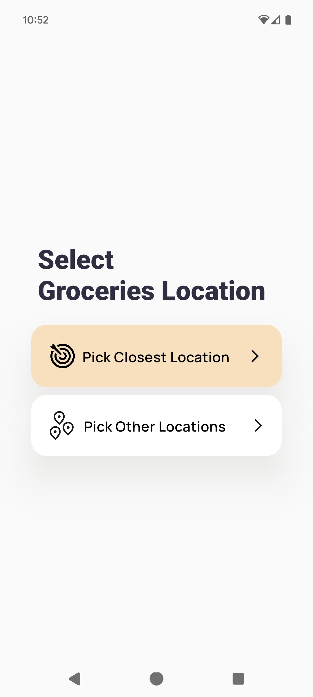
SelectResourceLocation.js
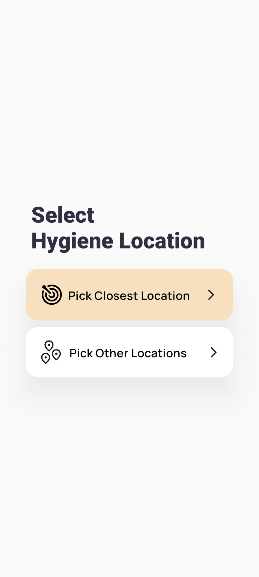
SelectResourceLocation.js
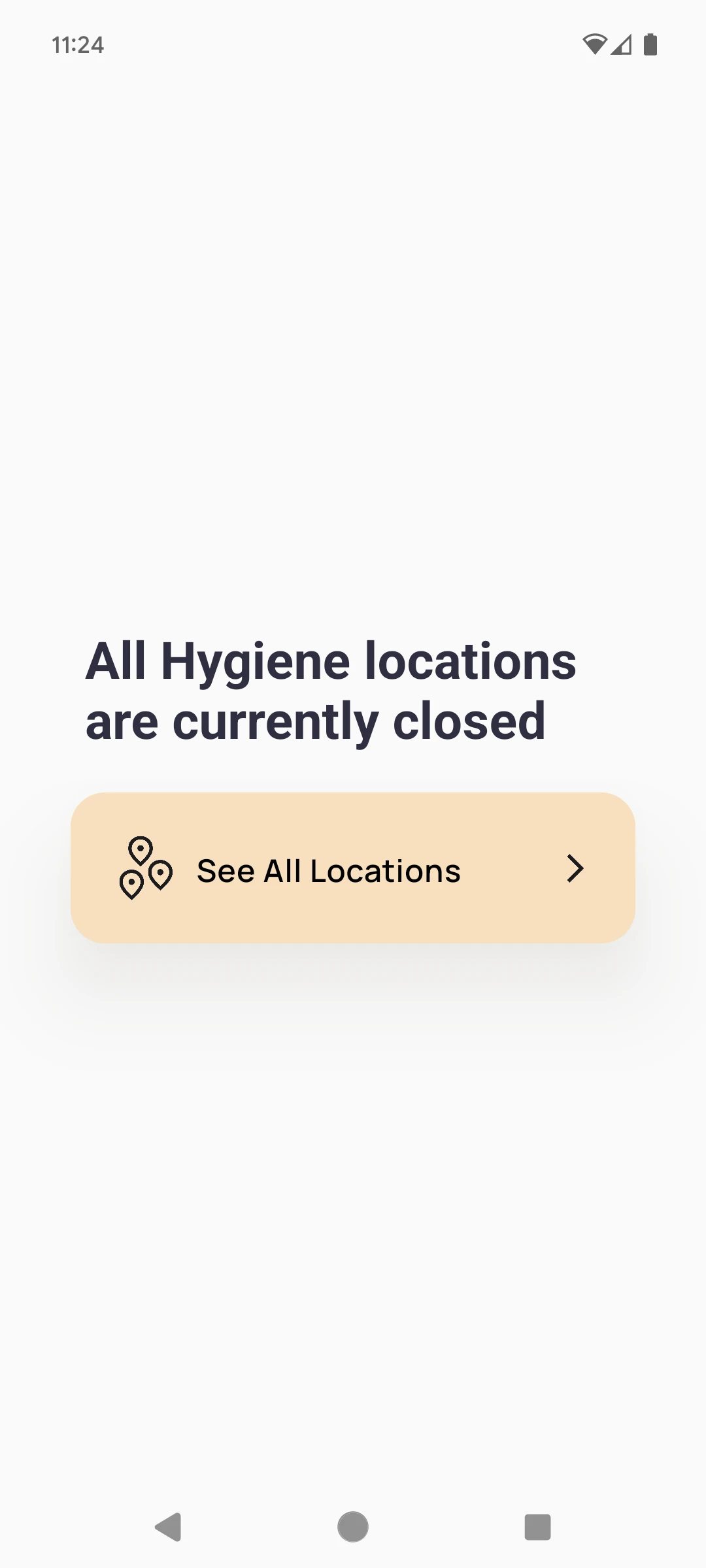
AllLocationsClosed.js
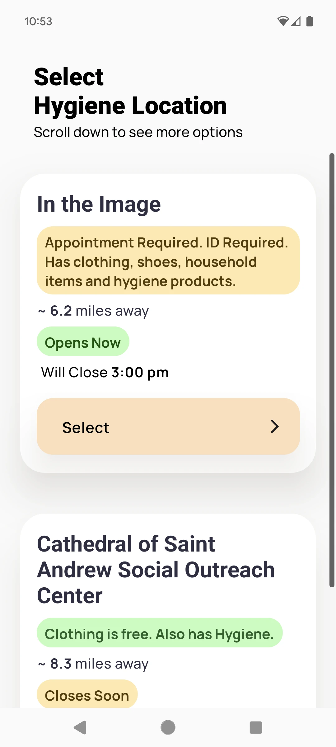
ResourceLocationsList.js
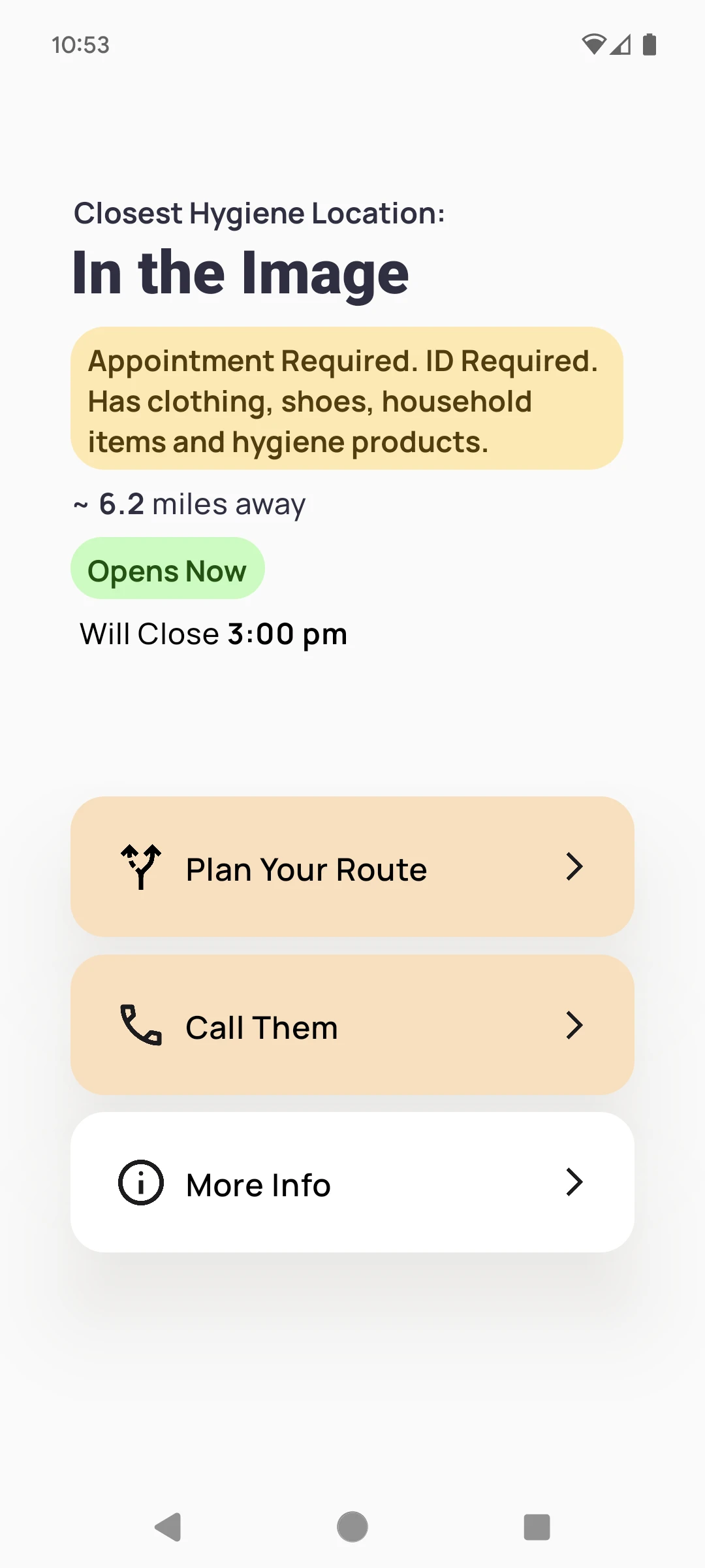
ResourceLocation.js
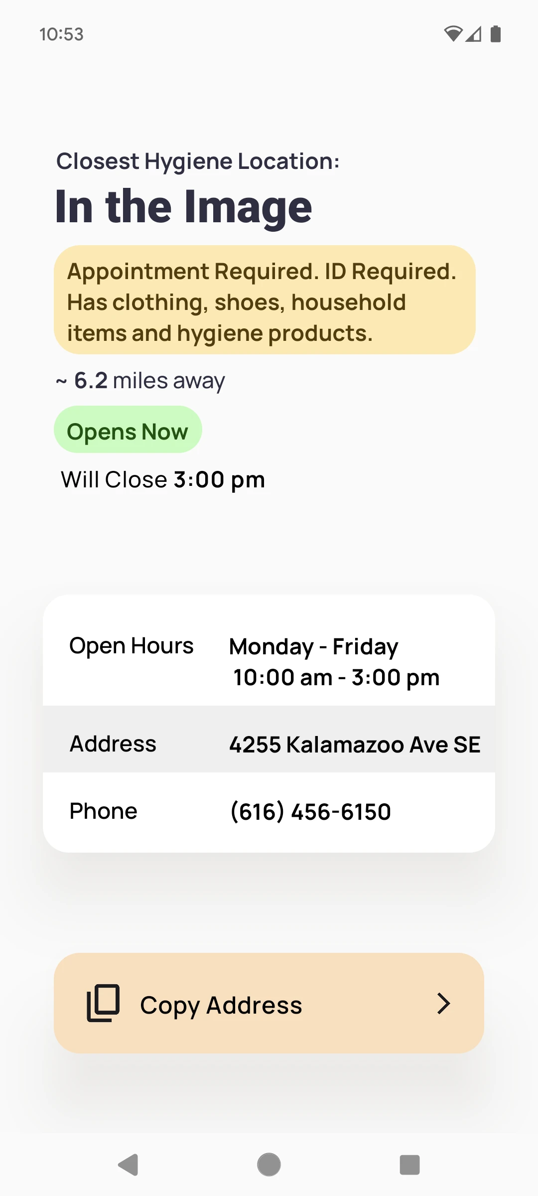
MoreInfo.js
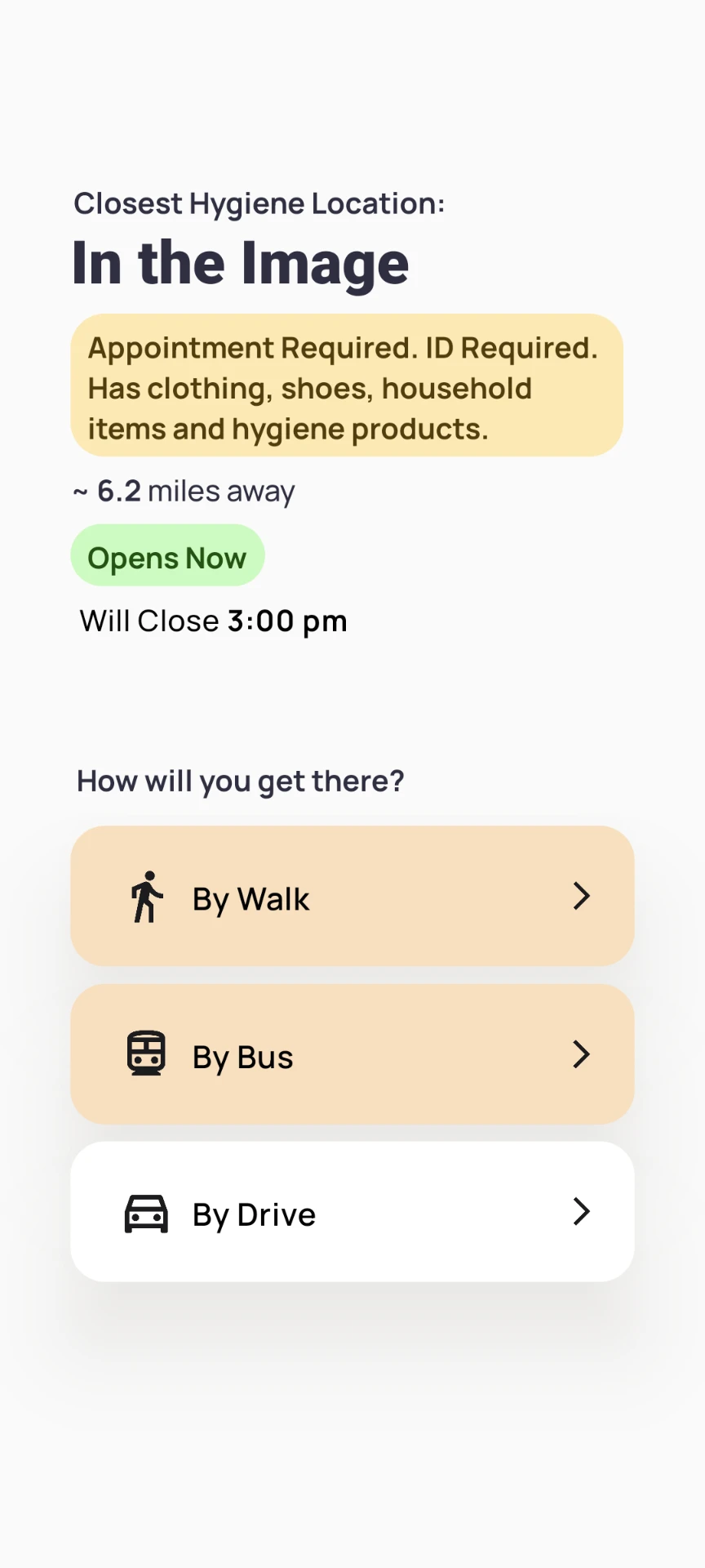
SelectTransportation.js
/components/GoogleMapsTutorial.js
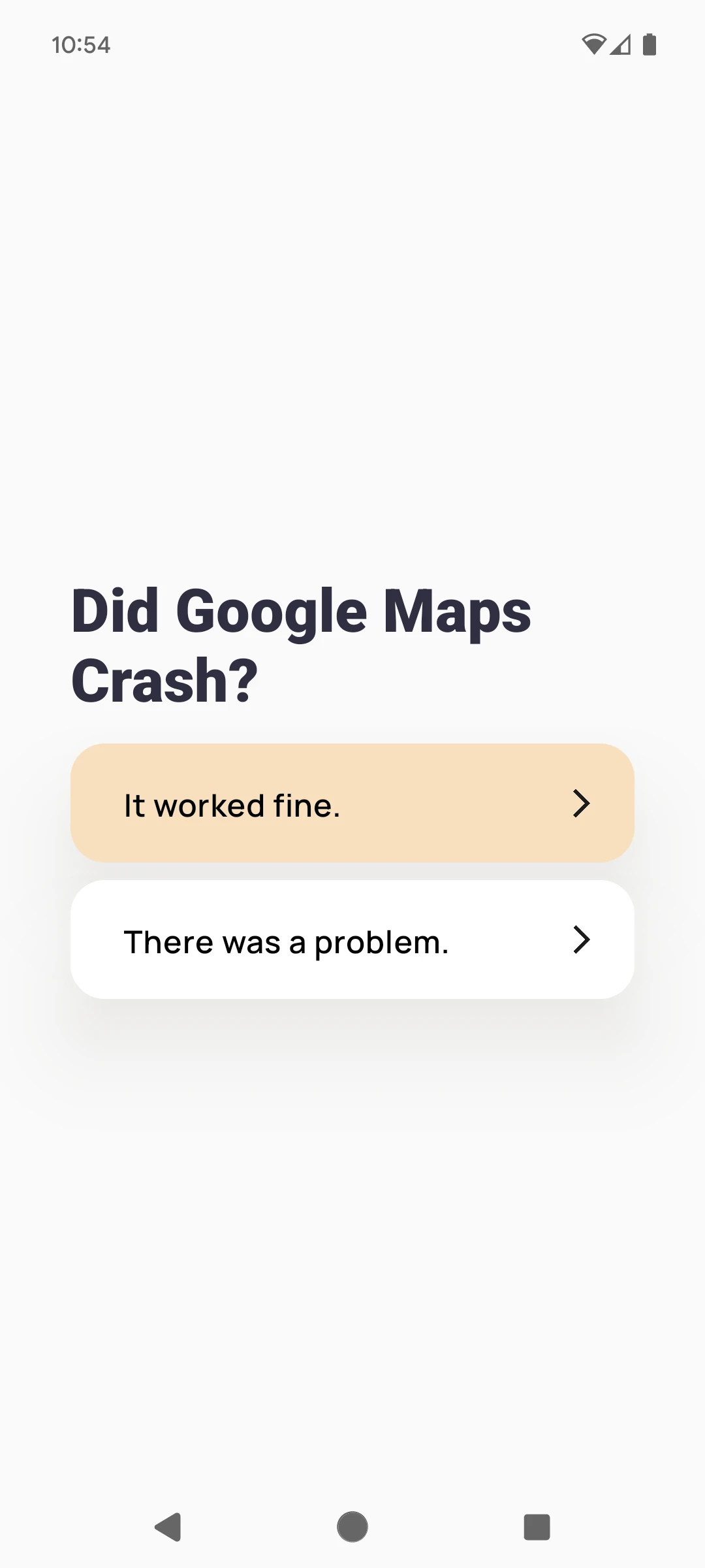
DidGoogleMapsCrash.js
DidGoogleMapsCrash.js
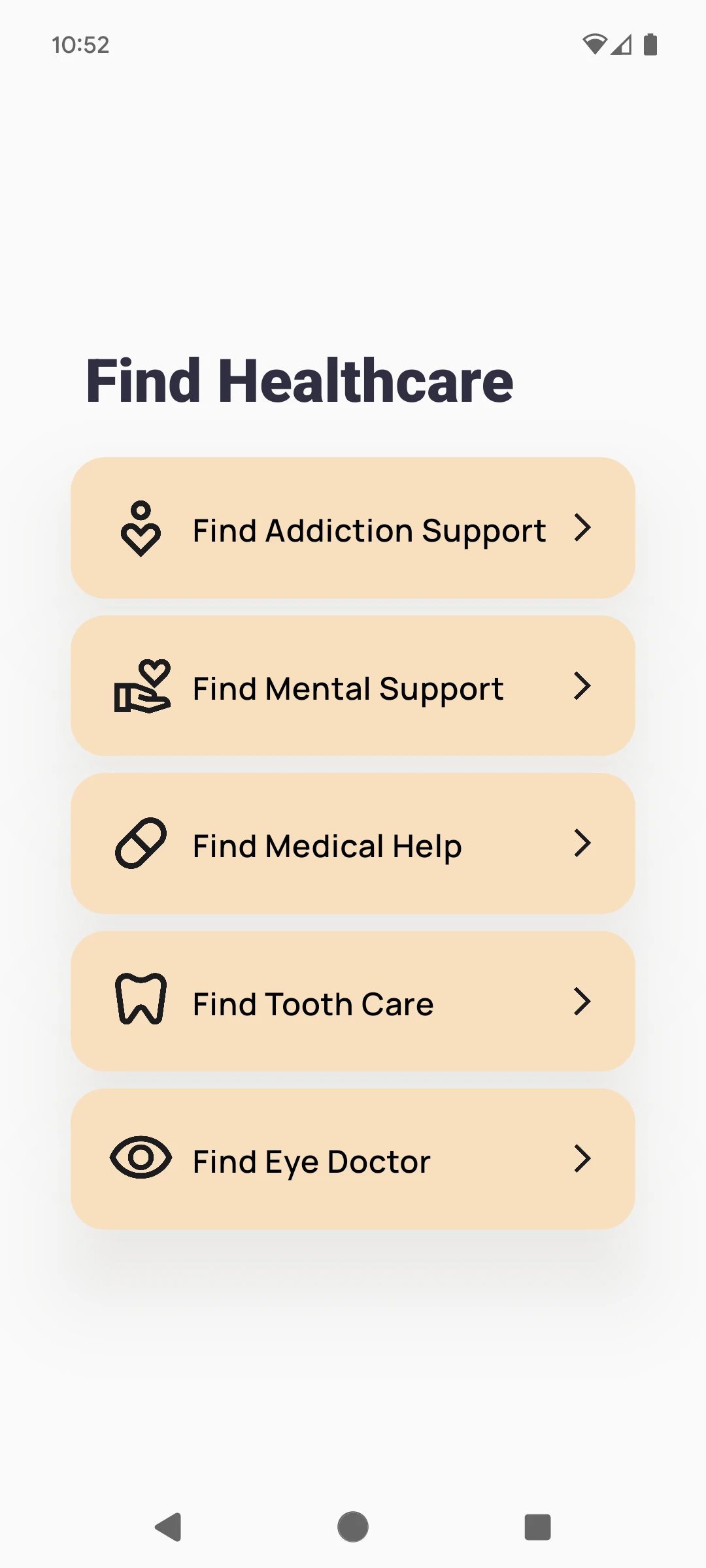
FindHealthcare.js

Technology Stack Evaluation
- Agile methodology for software development. Utilized Scrum framework for iterative and incremental development.
- Trello for agile project management, Used for backlog management and sprint tracking.
- Github for hosting git repository
React Native as framework
- Large Community: accessible to large amount of npm packages.
- Cross-Platform Code: One set of code for multiple potential platforms.
- Expo for managed workflow and easy debugging on physical devices
- Yarn as local package management, as it perform better than npm
Map Integration Decision
Options Considered:
- Develop a fully-featured map applications, including navigation that leads user to resources locations that provides food, clothing, etc.
- Create an app that generates links to Google Maps with few clicks.
- Decision: We chose option 2 - generating links to Google Maps.
Rationale:
- Cost-effective: Avoided expensive API costs for local bus route data
- Sustainability: More beneficial for long-term maintenance and updates
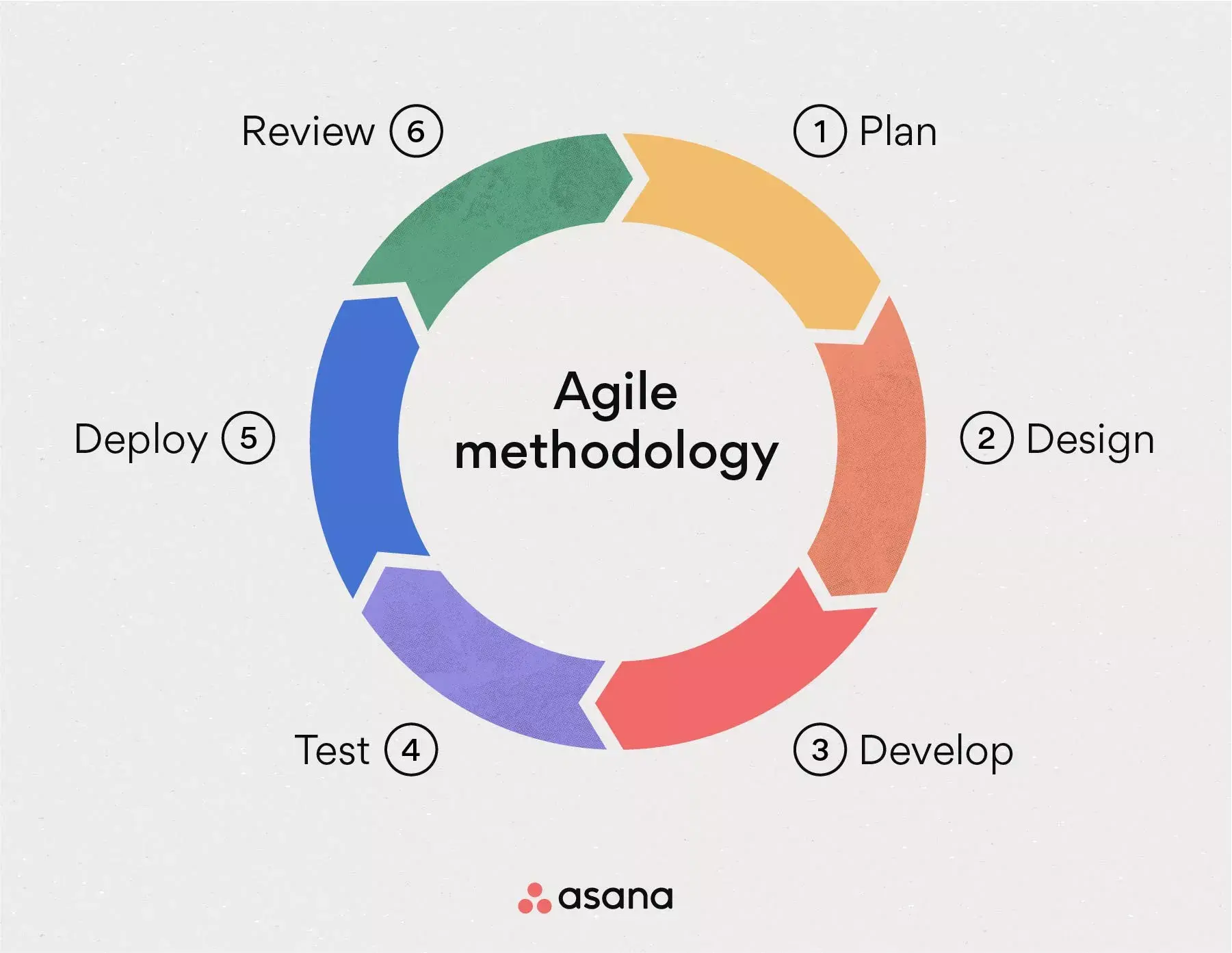
(Credit: Asana)
The Website
The website for ReentryGuide GR is built using Docusaurus and React, serving three primary functions:
Provides a google play link, ensuring easy access for users.
For those who cannot use a smartphone.
Allowing developers to fork the project and adapt it for use in their own cities.